Airtable Homepage
Most tools that promise “structured teamwork” end up looking like spreadsheets in suits. Airtable flips that idea. Their homepage mixes playful illustrations with slick UI visuals, turning collaboration into something that feels creative, not corporate.
The Marketing Analysis
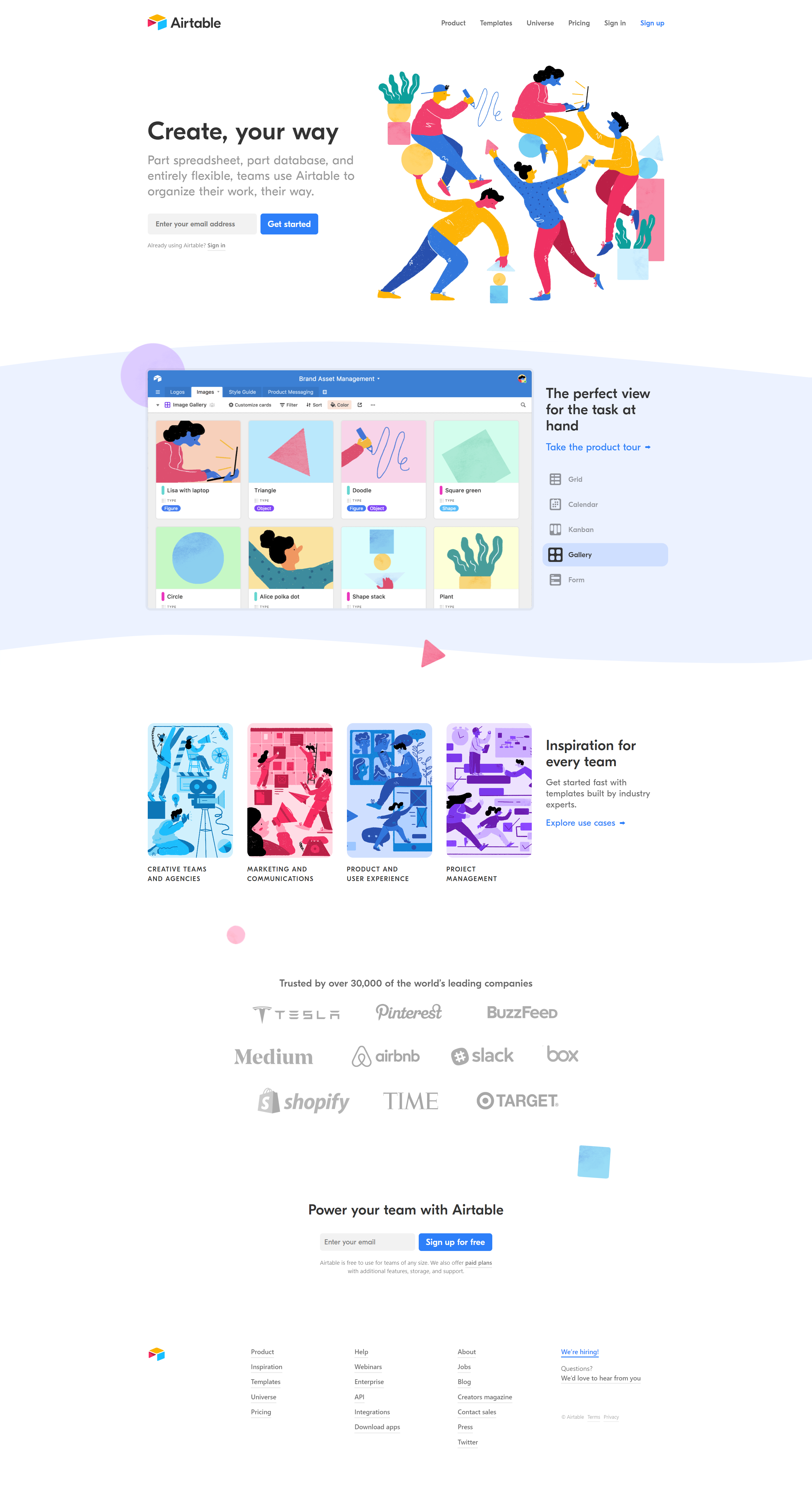
The hero line “Create, your way” gives instant clarity. Then the graphics of people moving colorful shapes act as a visual metaphor for flexibility and flow. You instantly get what Airtable does—structure without stiffness.
Why It Works
- Fast, clear headline that sells freedom
- Visuals show action and collaboration
- Bright, friendly color palette offsets the “SaaS” coldness
- Social proof builds trust with recognizable logos
- Repeated CTAs make conversion easy
Real-World Examples
- Notion uses calm, soft visuals for flexible work vibes
- Mailchimp’s fun art style makes marketing less intimidating
- Slack’s homepage visually organizes chaos into clarity
- Asana balances simplicity with vivid illustrations of teamwork
Analyzed by Swipebot
Loading analysis...
