Apartment Rental Flyer With Lots Of Pics/Info
Updated on

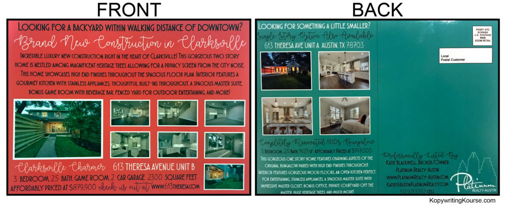
This apartment flyer grabs your eyeballs before you even read a word. It’s wide, glossy, and bursting with visuals that guide your eyes exactly where the marketer wants them to go.
Marketing analysis
Look closely and you’ll see how it’s built to flow naturally. Your eyes hit the bold “LIVE & PLAY” first (high contrast = instant pull), then bounce across bright photos that show lifestyle, not floor plans. Finally, attention lands on the CTA and contact info right as interest peaks. This flyer is storytelling in layout form.
Why it works
- The wide size screams different in a pile of boring mailers
- Contrast makes headlines unmissable
- Photos show emotion before you read logic
- Visuals guide attention from dream → detail → decision
Examples
- Zillow listings with bold headers boost scroll depth 30%
- Airbnb’s photo-first design converts up to 2x better
- Postmates bright yellow CTAs pull first clicks fast
- Apartment communities using big scenic images see 40% higher inquiries
Analyzed by Swipebot
Loading analysis...