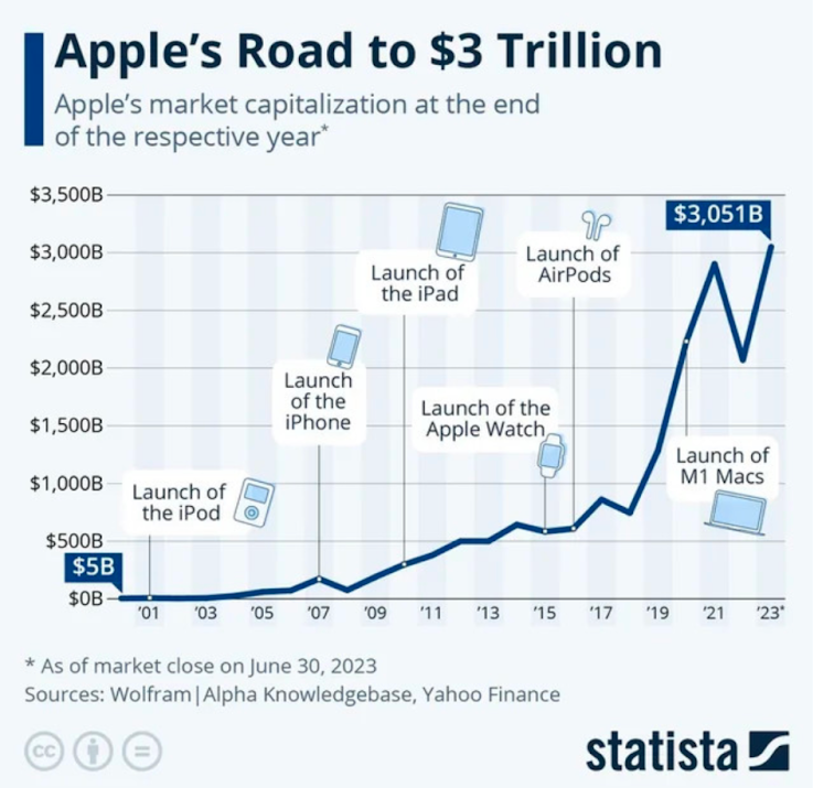
This is a cool visualization of major produce releases that helped Apple reach a $3T+ valuation. It would be cool to make a revenue chart like this with other companies, including your own!


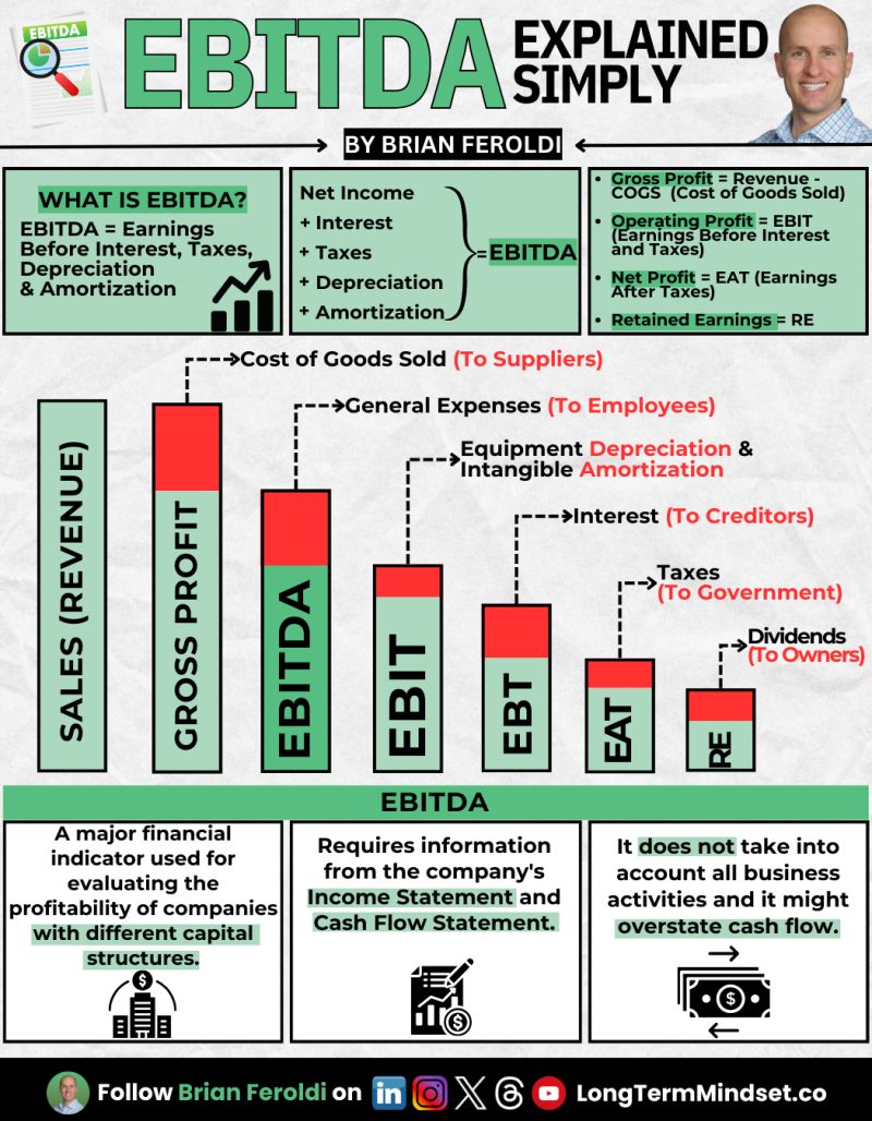
Warren Buffet and Charlie Munger famously hated the "EBITDA" method of calculating profit, because it doesn't account for allllll the...
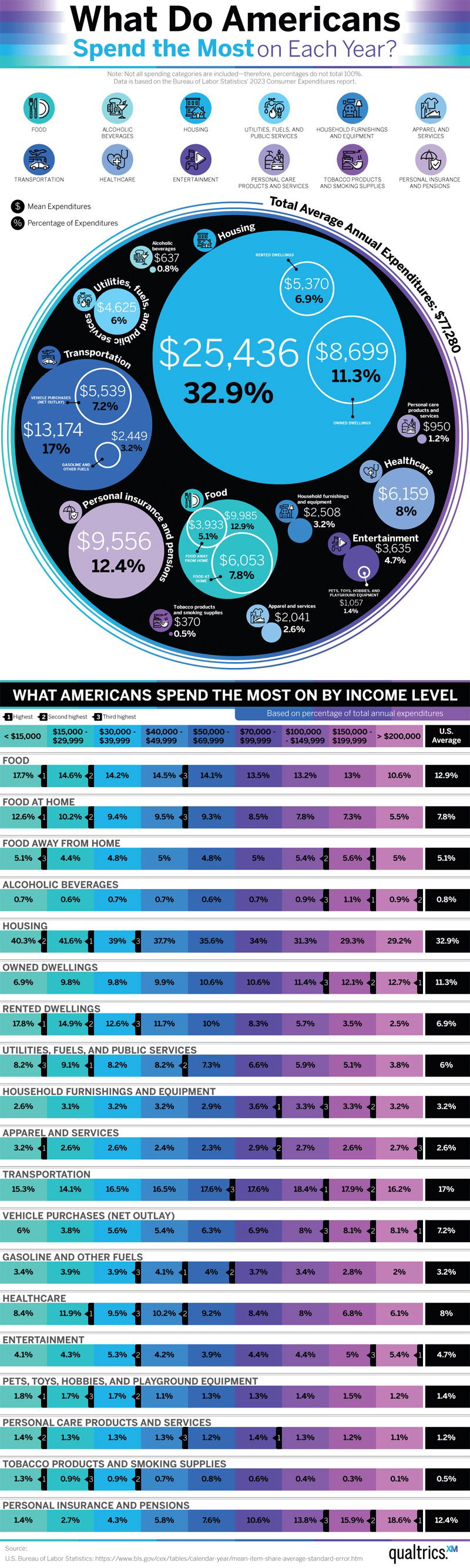
Here is where Americans actually spend their money. This chart also breaks it down by income level
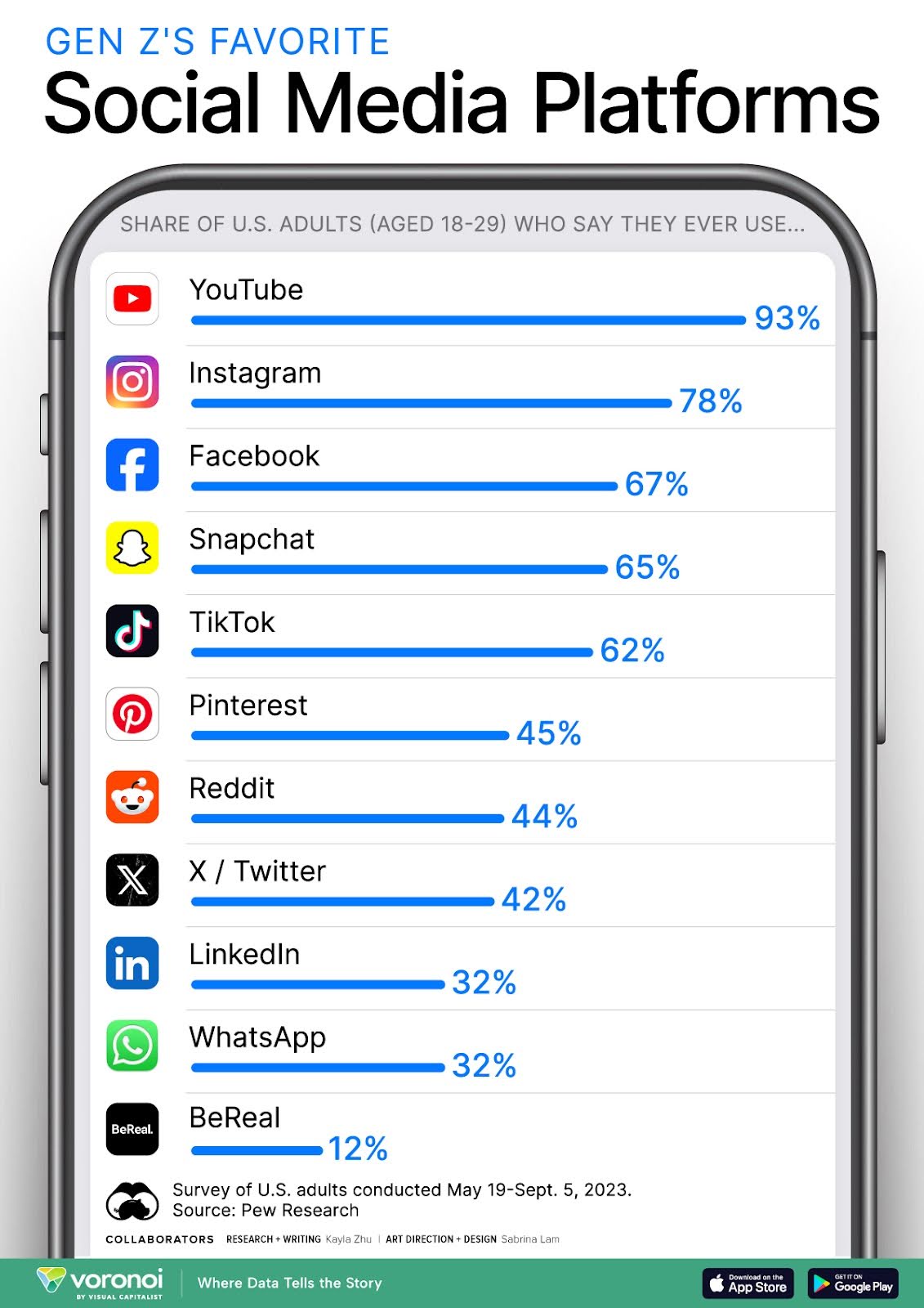
Here is an easy-to-understand graph showing which social media platforms are used by 19-29 year olds

With already massive growth of OpenAI, I was surprised to see them advertising trying the ChatGPT image features on Reddit....
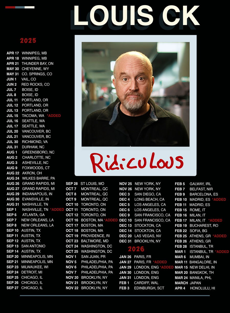
One of the careers I'm fascinated by is the stand-up comedian. Their schedules and lives are SO insanely weird compared...
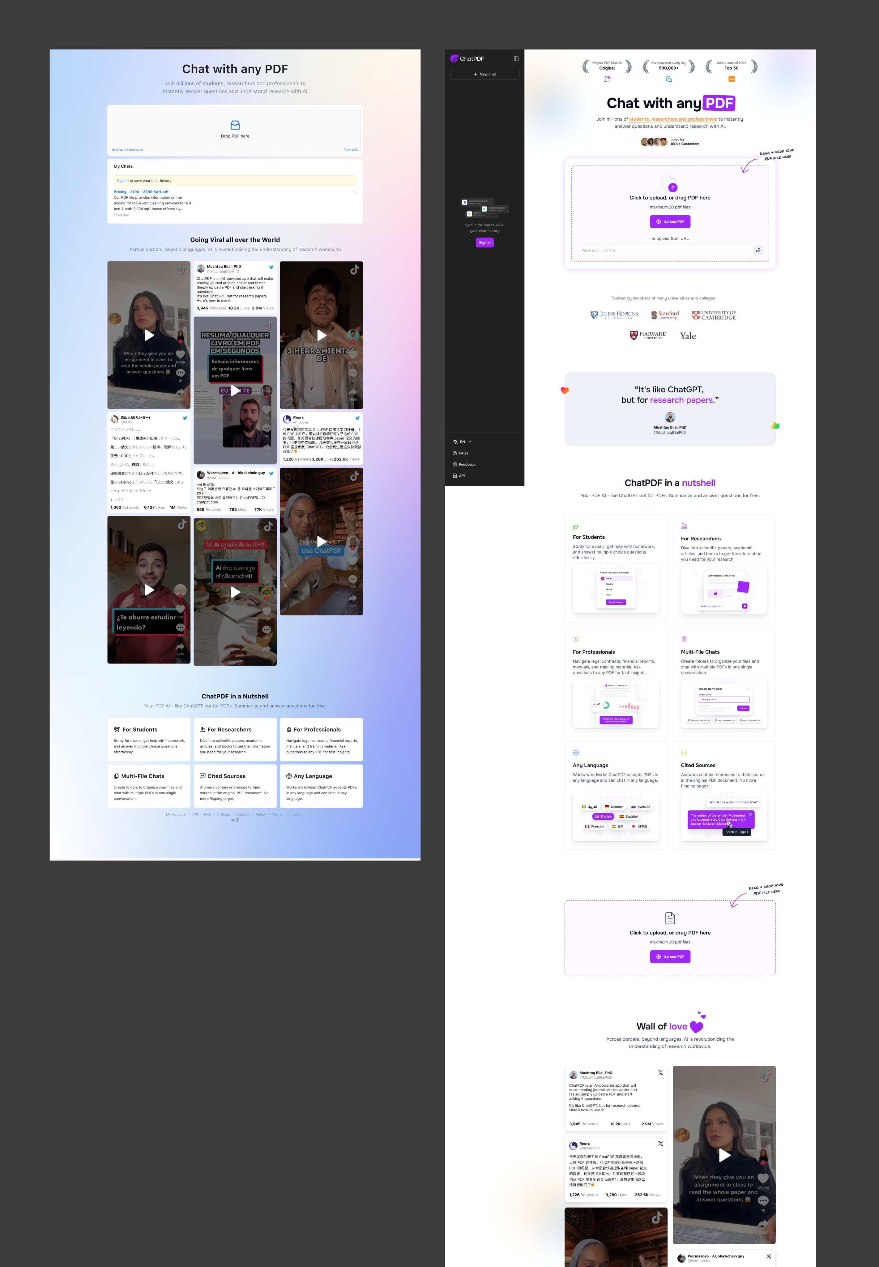
This redesign of the Chat with any PDF website is cleaner and does a better job of explaining how to...
Search for a command to run...