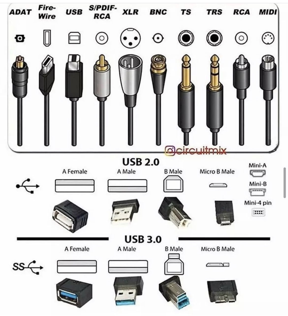
This single chart packs 21 different port types into one tidy visual. No fluff, no scrolling, no confusion. Just the right mix of icons, labels, and structure.
Why this tiny visual works
- Information hierarchy: Big icons first, small text second. The brain processes visuals ~60,000x faster than text.
- Consistent design: Uniform layout makes comparison effortless.
- Chunking: Grouped by type (USB 2.0, USB 3.0), so your brain sorts info naturally.
- Scannability: Clear, direct labeling helps instant recognition.
Real-world marketing uses
- Apple’s product pages with clean visuals showing size and color options.
- Airbnb’s amenity icons that explain everything at a glance.
- IKEA’s assembly guides that communicate without words.
A little text plus great visuals = clarity that sticks.
Analyzed by Swipebot
Loading analysis...
