416 Before and After Examples
Discover the power of transformation with our Before and After Examples. See how products and services can change lives, looks, or spaces. From home renovations to personal makeovers, witness the dramatic differences and get inspired by real-life changes.
Most Popular in Before & After

Stop Designing Products. Design Feelings.
Most brands obsess over specs, fonts, and Pantone swatches. Meanwhile, the products that win shelf space are busy doing something...

Recreate PostHog Aesthetic for Your AI Library
You don’t need a full-time art team to make your AI library look like a $10M product. Alex Lieberman used...

Ship Imperfect Offers, Iterate Quickly
That dartboard image nails it. One board is spotless after “10 hours of thinking.” The other is full of holes...
old: Viral content
new: Viral demos
Replace Viral Content With Viral Demos
Everyone’s chasing viral content, but likes and views don’t pay the bills. Viral demos do. When the thing that spreads...

Austin Skyline: 10 Years of Massive Growth
Look at these two photos and you can literally see Austin’s population boom in concrete and glass. Same angle, same...
Our $100K Client Reach-Out Tactic
Most people send a sad little cold email and pray. Our clients send a full-blown mini campaign that looks like...

Slash 44 Clicks by Questioning Assumptions
The clip screenshot says it all: someone staring slightly upward, clearly thinking, not selling. That single expression captures the real...

Beat The Heat In Seconds With 8-Pole Inverter
This Samsung ad doesn’t just talk about cooling power, it shows it in one bold visual. A blazing desert camel...

Turn Listing Photos into $15 Cinematic Renovation Videos
You do not need a camera crew to sell jaw‑dropping real estate videos anymore. With listing photos and an AI...

Sequence Your Ambitions: One Goal At A Time
The image shows two grids of squares. In the top grid, every square is blue: every dream active, every project...

5 Reasons to Upgrade Your HVAC Before Winter
This split-screen HVAC photo, half rusted and half brand-new, sells harder than a page of specs. Paired with the line...

Ditch the $8,000 Studio: iPhone and $80 Mic
This carousel is a before-and-after story for creators. You watch an $8,000, three-camera podcast studio slowly appear…then get replaced by...
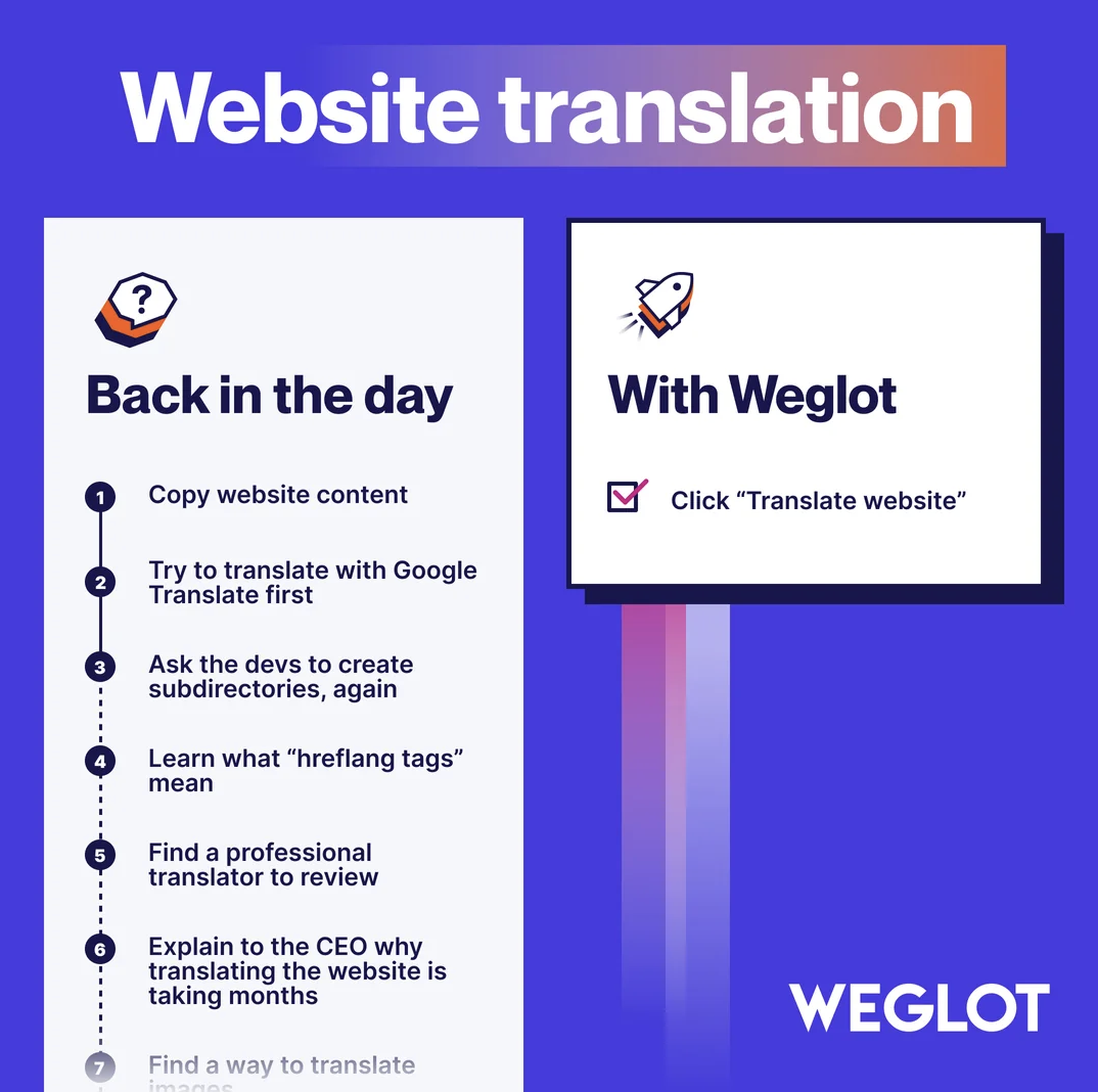
One-Click Website Translation With Weglot
The graphic for “One-Click Website Translation With Weglot” does all the selling in two columns flat. On the left: the...
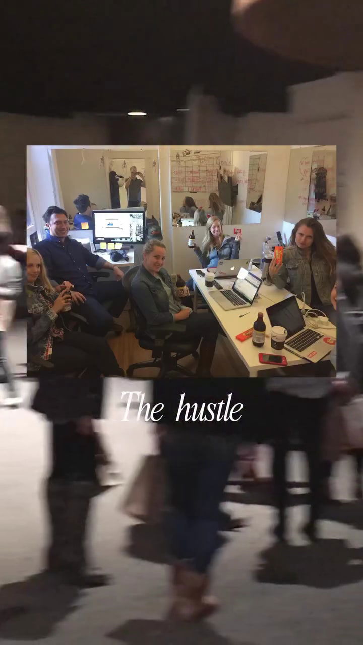
Stop Building Alone After $3M
Look at the photo: a tiny, overstuffed office on top, a costumed crew partying on the bottom. Same business, different...

Rebrands and pivots that made companies more money.
Here’s 30+ examples of companies that rebranded or slightly pivoted their product to make a bunch more money.#1.) Old SpiceBefore...
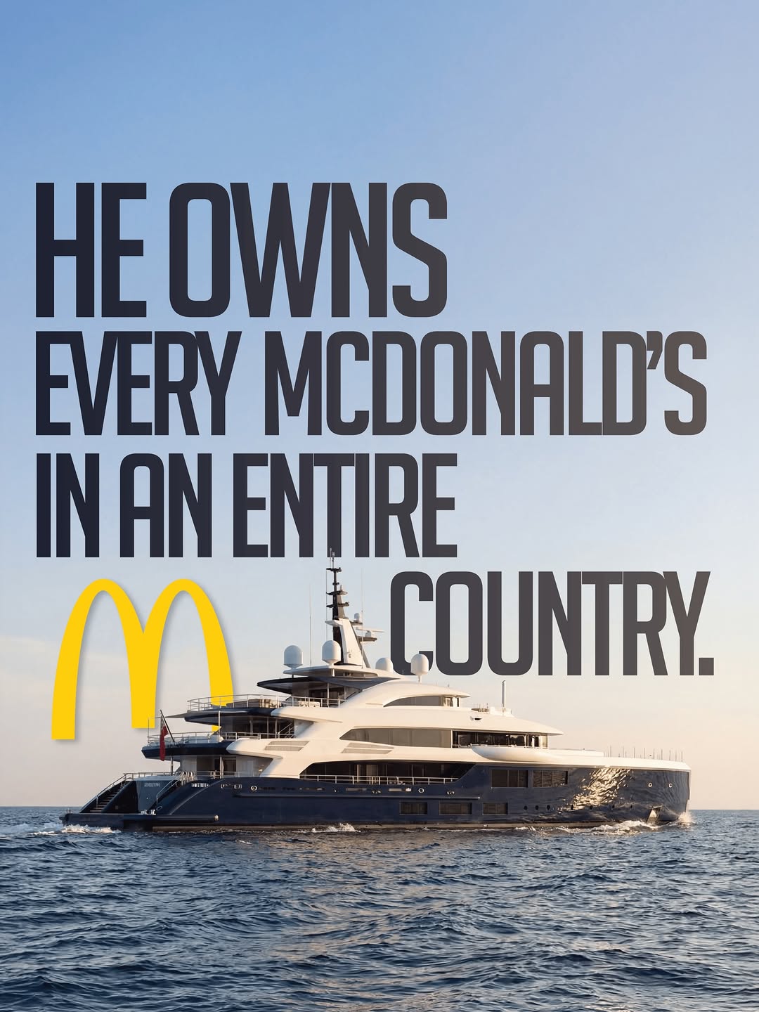
From Pizza Boy to Billionaire Yacht Owner
Mohamed Mansour’s journey is a masterclass in comeback power. Born into wealth, stripped of everything, then rebuilt an empire from...

Nanit Turns Baby Data into Parenting Insights
The Nanit Insights chart makes it easy for parents to understand what each plan offers without overthinking it. In one...

Remodeling Print Ad
This ad from Prime Construction & Remodeling is a masterclass in clarity and trust-building. It instantly tells you who they...

The Streaming Wars Brought Piracy Back From the Dead
This comic sums up the streaming era perfectly. Back in 2012, Netflix made watching shows online simple and affordable. We...

Why Writing Things Down Clears Mental Clutter
This image nails a simple truth: your mind gets messy when you try to store everything in it. The top...

DeArrow's gif for "de-sensationalizing" YouTube Titles and Thumbnails
The image shows a split YouTube feed — the left half packed with over-the-top titles promising the impossible, and the...
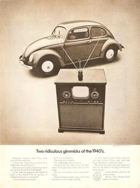
When “Ridiculous” Becomes Revolutionary
This classic Volkswagen ad flips skepticism into admiration. It pairs a Beetle with a 1940s television, mocking how both were...
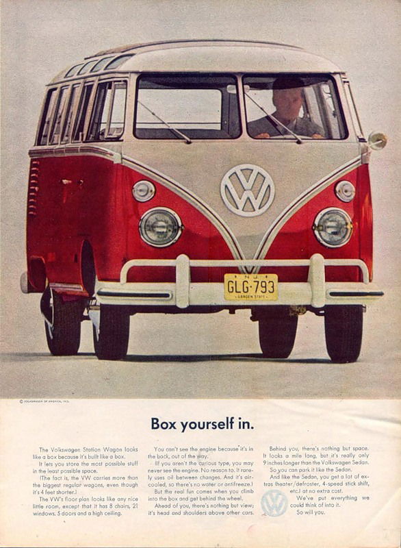
How VW Turned a “Box” Into a Dream Vehicle
This old Volkswagen ad flipped a weakness into a selling point. A boxy van became something people wanted to “box...
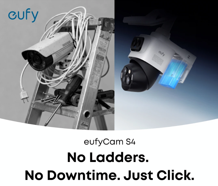
Eufy Ad: "No Ladders. No Downtime. Just Click."
Simple headline. Striking visual. Crystal-clear benefit. This Eufy ad nails clarity and contrast in one shot.Marketing BreakdownThe ad splits into...