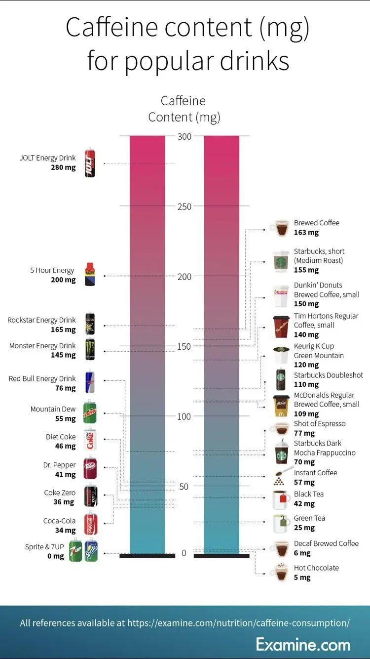
This chart does something most ads fail to do — it makes complex info instantly clear. In one glance, you can tell how much caffeine a Coke, coffee, or energy drink hits you with.
Why this works
- Instant contrast: People love quick comparisons — it’s visual storytelling.
- No clutter: Clean columns, aligned labels, and white space make scanning easy.
- Visual anchors: Product logos act as mental shortcuts.
- Emotional hook: Everyone drinks caffeine, so it hits universal curiosity.
Real-world examples
- Apple’s iPhone comparison pages show differences side-by-side — easy pickings.
- NerdWallet’s mortgage calculators display visual ranges to clarify confusion.
- The New York Times uses simple bar charts for election results to boost reader trust.
- Spotify Wrapped highlights personal stats in bold, visual, easy-to-digest graphics.
Analyzed by Swipebot
Loading analysis...
