00:00
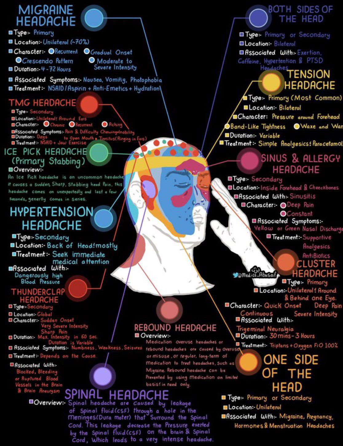
Ever see an infographic that just clicks? This headache chart nails it. In one glance, you can understand eight types of headaches, where they hit, and what causes them. That’s pro-level visual communication.
Why it works
- Uses visuals to reduce mental load
- Clear color coding for fast scanning
- Simple icons and arrows instead of paragraphs
- Spatial mapping makes data intuitive
Examples
- Mayo Clinic infographics on symptoms use icons + color zones to simplify medical info.
- Spotify Wrapped visualizes complex listening data in one fun scroll.
- HubSpot flywheel graphic boiled down their entire growth model into one circle.
- NYT Health graphics often use shaded body zones for immediate clarity.
Great design makes data feel simple, not simplified.
Analyzed by Swipebot
Loading analysis...
