CrewFire nice and clean homepage
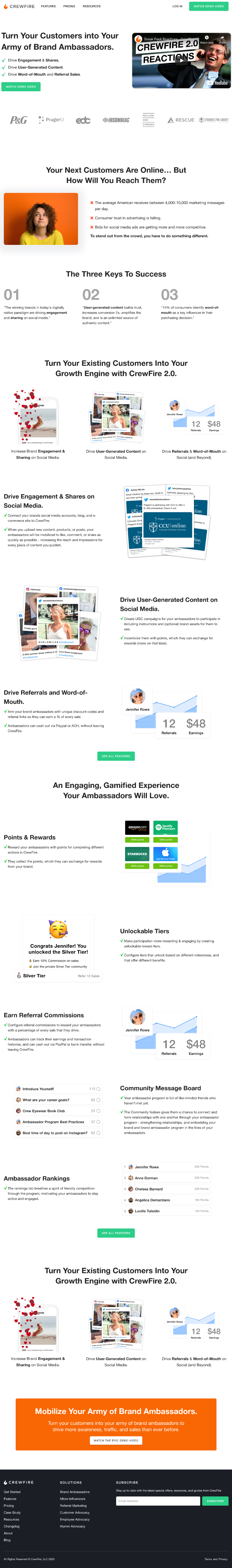
CrewFire’s homepage is a masterclass in clean, no-fluff design. It reads like a smooth elevator pitch: what the product does, who it’s for, and why it works—all without wasting a pixel.
Why This Page Works
- Single focus: One main promise: turn customers into brand ambassadors.
- Easy scan: Headings, short chunks, and icons make it fast to skim.
- Visual proof: Logos, screenshots, and metrics boost credibility.
- Step-by-step flow: The structure naturally guides users down the page.
- Clear call-to-action: Every section leads you toward that bright green button.
Real-World Examples
- Stripe: Uses crisp copy and technical visuals to show clarity and trustworthiness.
- Basecamp: Simplifies messages into punchy benefits that scroll naturally.
- Airtable: Combines screenshots and micro-copy to show use cases at a glance.
- Calendly: Clear flow from problem to solution with zero clutter.
Analyzed by Swipebot
Loading analysis...
