Funny “direct mail” for a bad parker
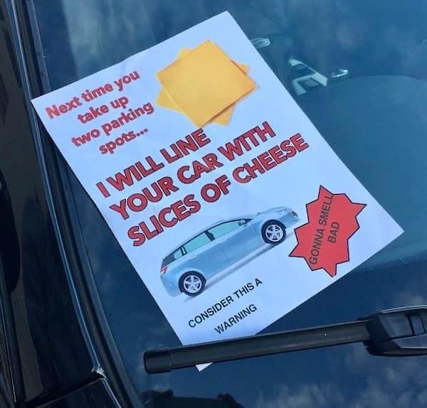
This cheeky note on a car breaking parking etiquette nails something marketers often miss: tone and clarity. It’s weirdly funny, oddly threatening, and totally unforgettable.
Why It Works
- Humor disarms: A ridiculous punishment (cheese?) makes people laugh, not angry.
- Visual contrast: Bold fonts, images, and red accents grab instant attention.
- Clear consequence: The message isn’t vague—you know exactly what happens if you double park again.
- Memorable gimmick: People remember absurd visuals way more than plain text.
Real Examples
- Dollar Shave Club’s launch video: humor and clarity built a $1B brand.
- Oatly’s “It’s like milk, but made for humans” line: bold honesty with a wink.
- Liquid Death’s branding: threat-level humor that sells water like a punk band.
Analyzed by Swipebot
Loading analysis...
