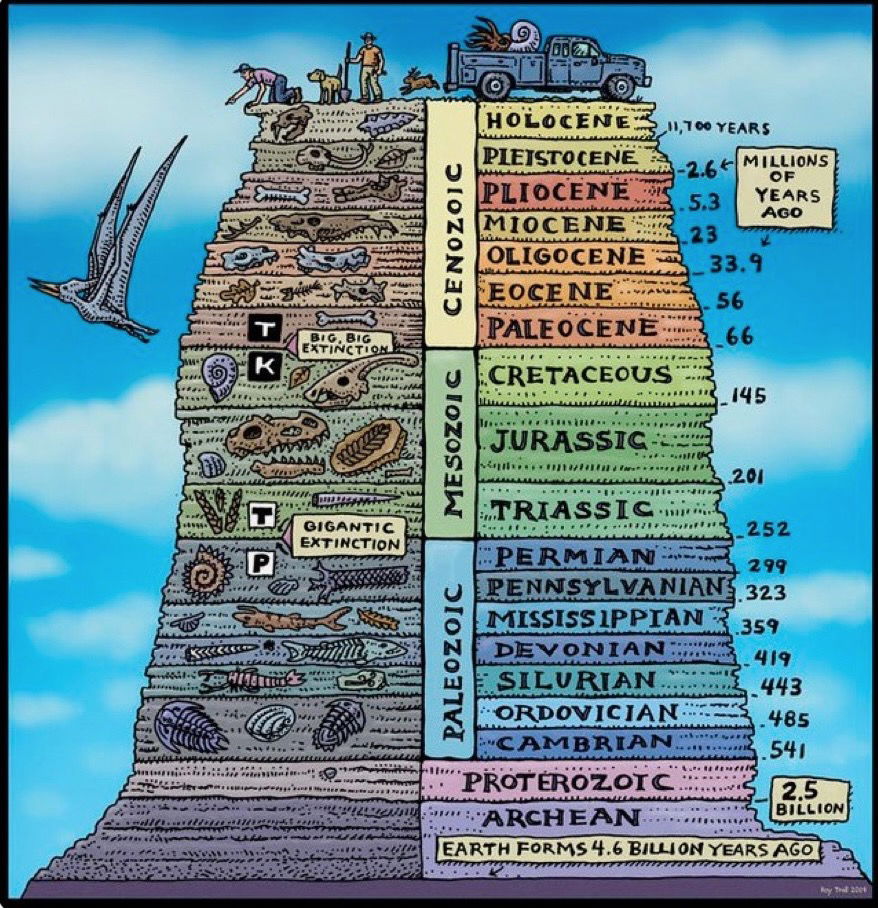
This chart by Rob Troll crams 4.6 billion years of Earth history into one colorful, scroll-stopping graphic. It’s not just fun to look at—it’s a masterclass in making complex information instantly understandable.
Why It Works
- Visual hierarchy: Big blocks, clear labels, and bright colors organize a ton of data.
- Storytelling through design: You “climb” Earth’s history layer by layer, just like a geologist.
- Smart simplification: It keeps just enough detail to educate without overwhelming.
- Humor hooks attention: The cartoon style lowers mental load and invites curiosity.
Real-Life Examples
- Wait But Why simplifies rocket science with stick figures.
- InformationIsBeautiful.net turns spreadsheets into candy for the eyes.
- Airbnb’s annual reports use visuals to turn dry data into stories about people and travel.
Analyzed by Swipebot
Loading analysis...
