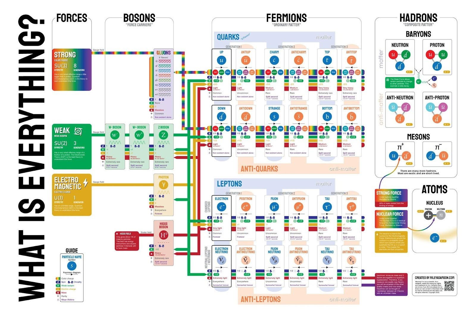
This wild-looking infographic explains what literally everything is made of—down to quarks and leptons. It’s nerdy, detailed, and a bit overwhelming, yet it makes the insanely complex feel… understandable. That’s exactly what great marketing content should do.
Why It Works
- Visual hierarchy makes thousands of details scannable.
- Color coding simplifies complex relationships.
- Category grouping brings order to chaos.
- Labels and icons make abstract ideas concrete.
- Contrast and spacing guide the eye naturally.
Examples
- Ahrefs blog uses strong visuals to explain SEO systems.
- Zapier guides show complex app automations through clean diagrams.
- Notion templates visualize workflows that seem messy in text.
- Figma’s site explains design concepts using labeled, color-coded layers.
Analyzed by Swipebot
Loading analysis...
