Global Gross Domestic Product (GDP) 2021 chart
Updated on
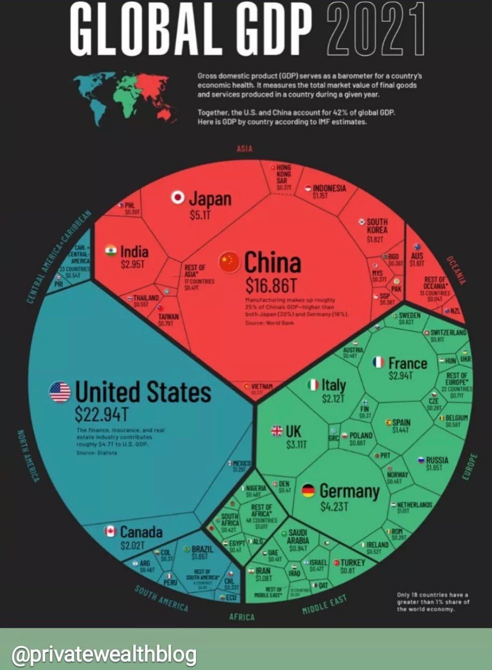
This chart nails what so many marketing visuals miss: it makes complex info instantly understandable. In just one glance, you feel the weight of global economies.
Marketing Analysis
The designer used color, size, and proximity to tell a story. Larger countries dominate the circle, smaller ones fit neatly around them. It feels more like a conversation than a lecture on GDP.
Why It Works
- Turns data into a shape the brain can quickly process
- Uses color coding to separate regions
- Shows proportion, not just numbers
- Simple labels make it scannable and shareable
Examples
- Spotify Wrapped visualizes your year of listening in colorful, shareable summaries
- The “Earth’s Billionaires” chart from Visual Capitalist makes wealth inequality visual
- Airbnb’s investment maps show growth hotspots at a glance
Good marketing visuals reduce thinking and increase clarity.
Analyzed by Swipebot
Loading analysis...
