Measles Decline Chart After Vaccine In 1963
Updated on
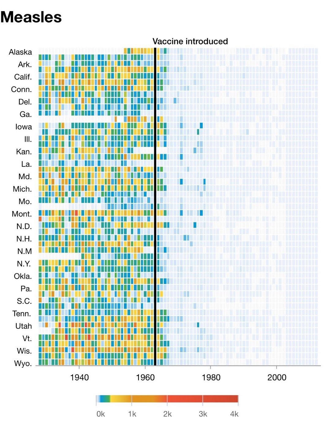
This chart tells a powerful story: before 1963, measles was everywhere. After the vaccine? Practically gone. No hype, no slogans, just a visual punch of data clarity.
Why It Works
- Instant contrast: The bright chaos before vs. calm after draws your eye immediately.
- Proof, not claims: Data visualization builds trust faster than copy.
- One clear takeaway: No confusion about what changed or why.
- Emotion without drama: You feel the problem vanish just by looking.
Examples
- Apple’s “Battery Life” comparison charts work for the same reason—before vs after.
- Spotify Wrapped’s data visuals make you see your listening story.
- Charity: water shows “before/after” impact maps to show donation results.
Analyzed by Swipebot
Loading analysis...
