Good show but no tell. This Ad needs a headline.
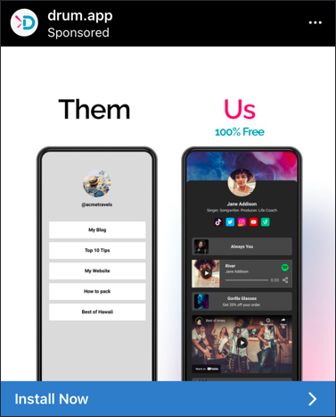
Scroll-stopping ad right here. Drum.app nails the classic “comparison” angle with a simple split screen: boring vs better. One glance and you instantly know which side you want to be on. No long copy, just visuals that say it all.
Why This Ad Works
- Dual-column layout instantly communicates contrast
- Minimal text makes it thumb-stopping, not thumb-skipping
- “100% Free” adds a fast, clear value prop
- The CTA “Install Now” reinforces action
- Clean visuals make the “after” result irresistible
More Examples
- Slack: “Before Slack: chaos in emails. After Slack: organized teams.”
- Headspace: “Stressed mind vs Calm mind” animation.
- Grammarly: “Messy email vs Polished email” split-screen.
- Canva: “Blank doc vs Beautiful design” side-by-side.
Analyzed by Swipebot
Loading analysis...
