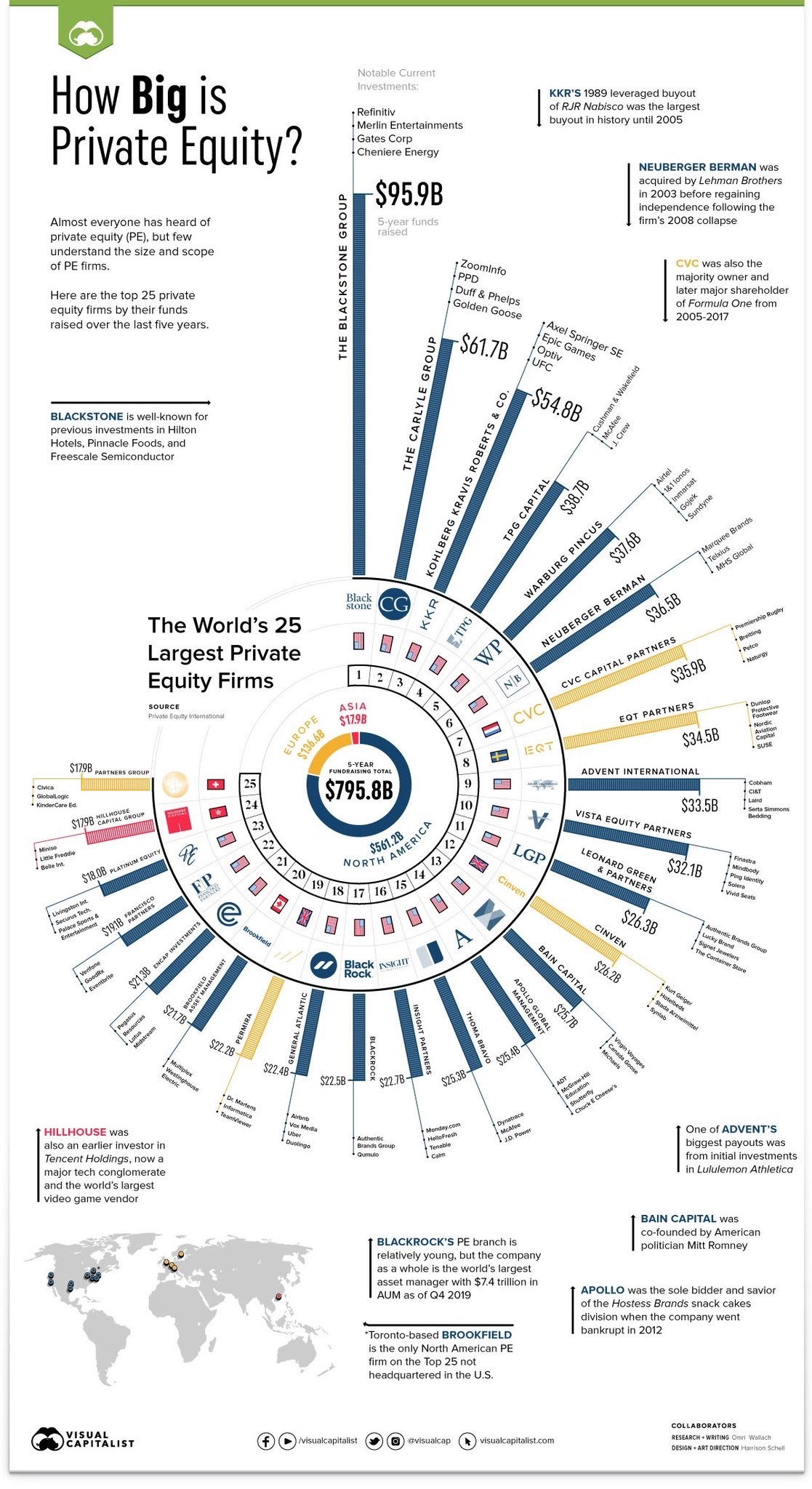
This chart by Visual Capitalist crushes the myth that all private equity firms are the same size. It maps out the top 25 firms by funds raised — and it’s a monster visual.
Marketing analysis
What makes it powerful is how it blends scale and clarity. You can instantly see that Blackstone towers over everyone else at $95.9B, while Asia’s share looks tiny next to North America’s. It turns dry finance data into a digestible visual story.
Why it works
- Uses a simple “bigger = more powerful” visual hierarchy
- Combines storytelling and hard data in one glance
- Makes relative scale feel real, not abstract
- Uses color and shape to separate regions and firms clearly
Examples
- Apple’s “Environmental Progress” visuals — big numbers turned into simple visuals
- Fortune’s “Top Companies” infographics — same clarity, same authority
- LinkedIn’s annual “Most In-Demand Jobs” reports — turning complex data into sleek circles of insight
Analyzed by Swipebot
Loading analysis...
