Chart showing amount of sweat produced by different areas of the body
Updated on
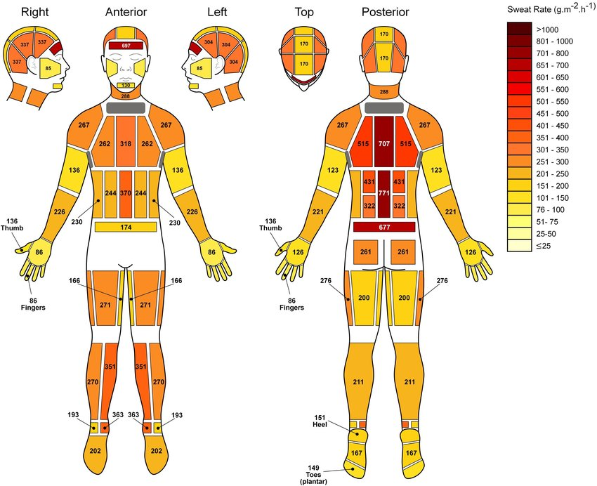
Here’s a weirdly satisfying visual: a full-body sweat map showing exactly where humans sweat the most. It looks scientific, but it’s also a masterclass in data storytelling.
Marketing analysis
This chart takes something complex and makes it instantly clear. Simple color gradients, clear numbering, and minimal text make the data pop without confusion. That’s clarity marketing gold.
Why it works
- Uses color to tell a visual story instantly
- Keeps copy minimal to reduce cognitive load
- Highlights key info with smart contrast
- Turns dull data into a visual you want to stare at
Examples
- Spotify Wrapped: turns raw listening data into eye candy
- Strava Heatmaps: visualize running routes with color intensity
- The New York Times graphics team transforms stats into scroll-stopping visuals
- Apple Fitness rings: color-coded progress easy to understand at a glance
Analyzed by Swipebot
Loading analysis...
.png?width=3840&quality=80)