Interesting data visualization of largest economies

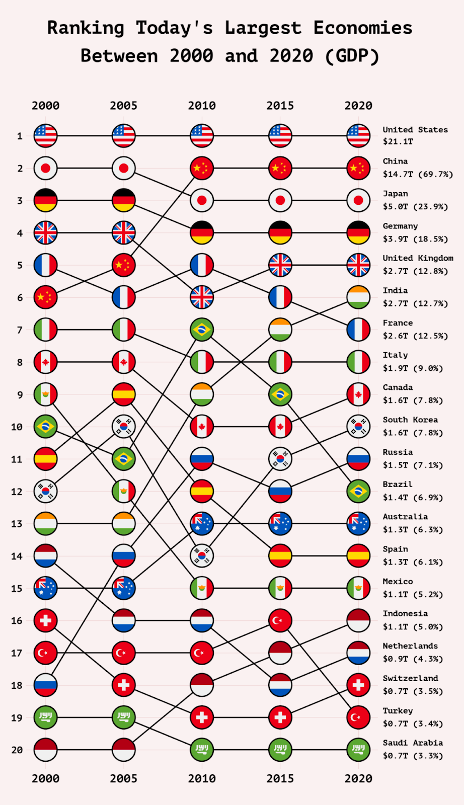
I love different ways of “showing data” and I’ve never seen this style before. It shows the movement in size of different economies over 20 years. It displays less information than a traditional line graph, but DOES layout this information easier and more attractively.

Q2 is near

Whatever your 2024 goal is, you have 9 more months to complete it

❌ Q1: January, February, March​
✅ Q2: April, May, June
✅ Q3: July, August, September
✅ Q4:

pluto

Total Addressable Market

When looking at market size it’s helpful to look at the realistic amount you can capture.

TAM: Total demand for a specific product/service in a market.

SAM: Portion of TAM