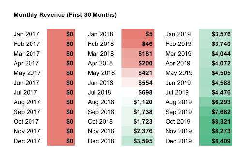
Revenue Replacement graph
Updated on

At first glance, this chart looks painful. Twelve months of $0 revenue. But that’s exactly what it takes sometimes to build something real. Pat Walls tracked his journey from zero to replacing his engineering salary with income from his own software business.
The power of patience and compounding
Every month of consistency stacked on the last. The first few dollars looked meaningless but proved the system worked. Once momentum hit, the growth turned exponential.
Why it works
- Shows the ROI of long-term consistency
- Visualizes the lag between effort and reward
- Builds trust by sharing unfiltered progress
- Turns abstract “grind” into measurable proof
Real-world proof
- James Clear’s blog grew for years before “Atomic Habits” exploded.
- Duolingo took nearly a decade to monetize profitably.
- Buffer shared transparent revenue updates to grow trust and community loyalty.
Analyzed by Swipebot
Loading analysis...
