Nufs Crackers page redesign before and after
Updated on
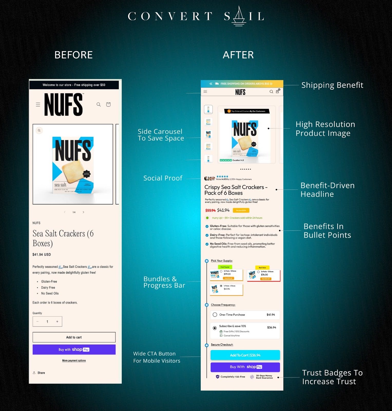
NUFS redesigned their cracker product page and saw conversion rates jump. The tweaks weren’t fancy—but they nailed basic sales psychology in design form.
Marketing analysis
The new design adds clarity, trust, and urgency. The old page just presented info. The new one sells. Notice how they use benefit-driven copy, visible pricing, and strong social proof to guide buyers to the “Add to Cart” moment.
Why it works
- Headline highlights benefits, not just the product name
- Visual hierarchy directs eyes to price and CTA
- Bulleted benefits for easy scanning
- Trust badges calm buyer anxiety
- Progress bar adds gamified motivation
Examples
- Amazon uses bullets and reviews for scannability
- Apple features crisp images and benefit-led headlines
- Allbirds includes "Free Shipping + Free Returns" above the buy button
- Casper adds trust badges and guarantees near CTAs
Analyzed by Swipebot
Loading analysis...
