Babbel's Summer Sale Ad
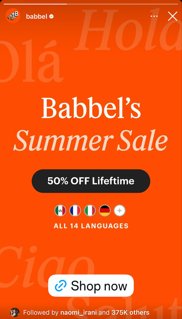
Two nearly identical Babbel ads—one for a “Summer Sale,” another for the “Biggest Sale.” Only the background color and headline change, but the lesson is big: small tweaks can shift how a deal feels.
Marketing Analysis
Both ads keep everything simple: bright color, one big benefit (50% off for life), and a clear button. But notice how “Summer Sale” feels seasonal and fun, while “Biggest Sale” sounds urgent and once-in-a-year huge.
Why It Works
- One clear message per frame
- Bright, trustworthy color palette
- Simple, strong CTA with no friction words
- Smart headline testing—emotional tone shifts perception
- Visual focus on the main benefit (50% OFF Lifetime)
Examples
- Airbnb’s “Summer Getaway” vs “Biggest Travel Sale” emails test urgency tone.
- Spotify swaps “Holiday Deal” for “Best Offer of the Year” to lift clicks.
- Calm app doubled conversions by keeping one bold CTA on bright backgrounds.
Analyzed by Swipebot
Loading analysis...
