Pie chart showing "How I Get Fat Baking"
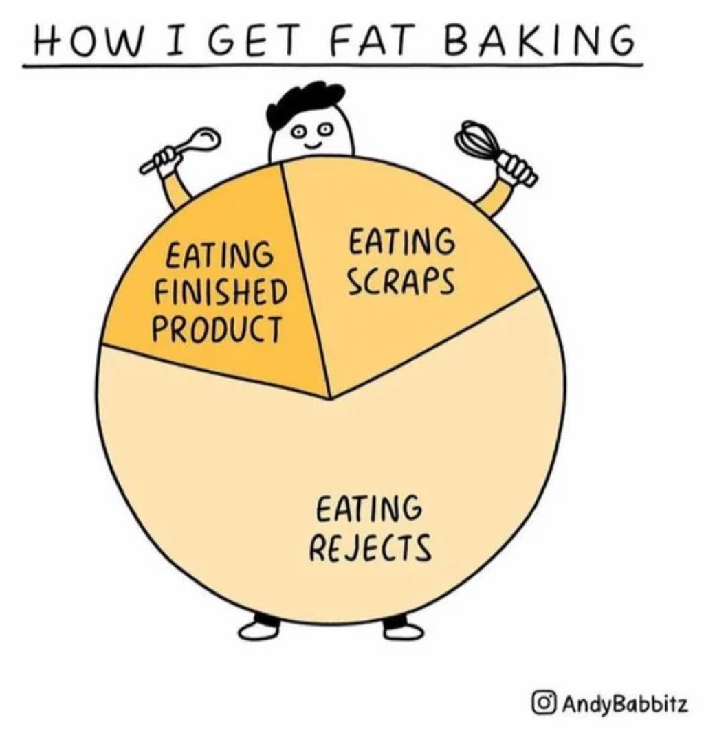
This cartoon “pie” chart nails a universal truth with humor: we eat way more “testing” our baking than actually eating the finished product. It’s visual, funny, and instantly relatable.
Why It Works
- Uses humor to build instant emotional connection
- Simplifies a common experience into one clear image
- Turns a “boring” chart into a visual joke
- Highly shareable—easy to tag and repost
Examples
- Duolingo uses relatable memes to make language learning feel fun
- Oatly fills packages with self-aware humor, boosting word-of-mouth
- Slack used playful copy (“Make work less work”) to humanize a tool
- Wendy’s Twitter uses sass and humor to keep engagement through the roof
Analyzed by Swipebot
Loading analysis...
