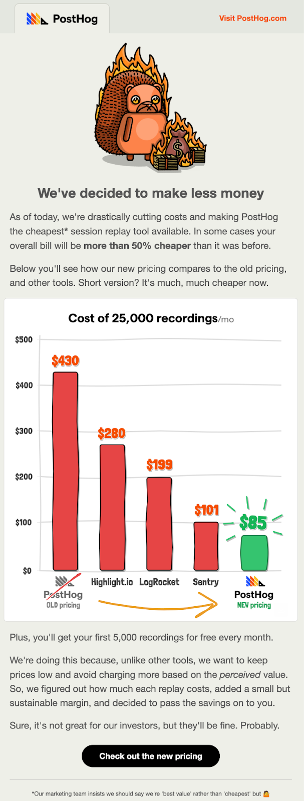
PostHog's email showcases their price cut against competitors with an excellent chart and a humorous headline.


To me, an image like this packs in a lot of data in a very easy-to-understand method.

Big, bold, and impossible to miss. Palantir uses simple design and strong words to make a powerful statement.
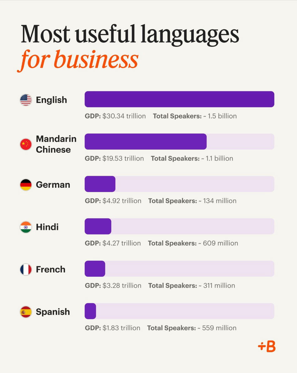
This chart shows the top languages for business. These are spoken in major markets, so knowing them helps companies grow...
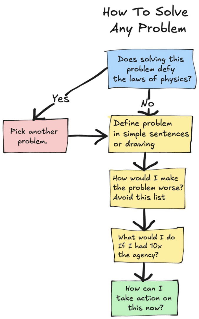
This easy chart defines how you can solve pretty much any problem through first principles by breaking it down into...
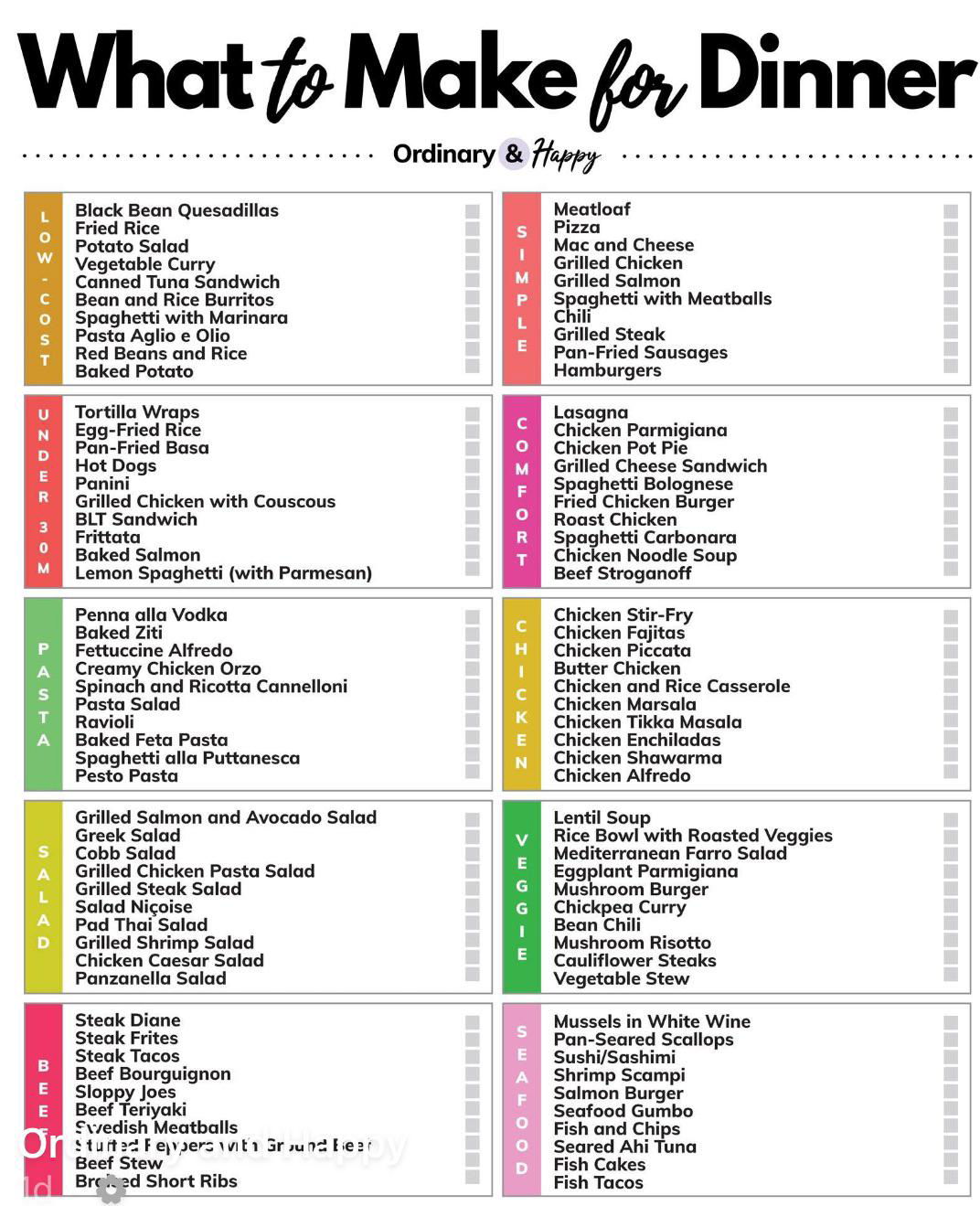
This simple chart with no images gives a list of what to make for dinner based on different categories like...
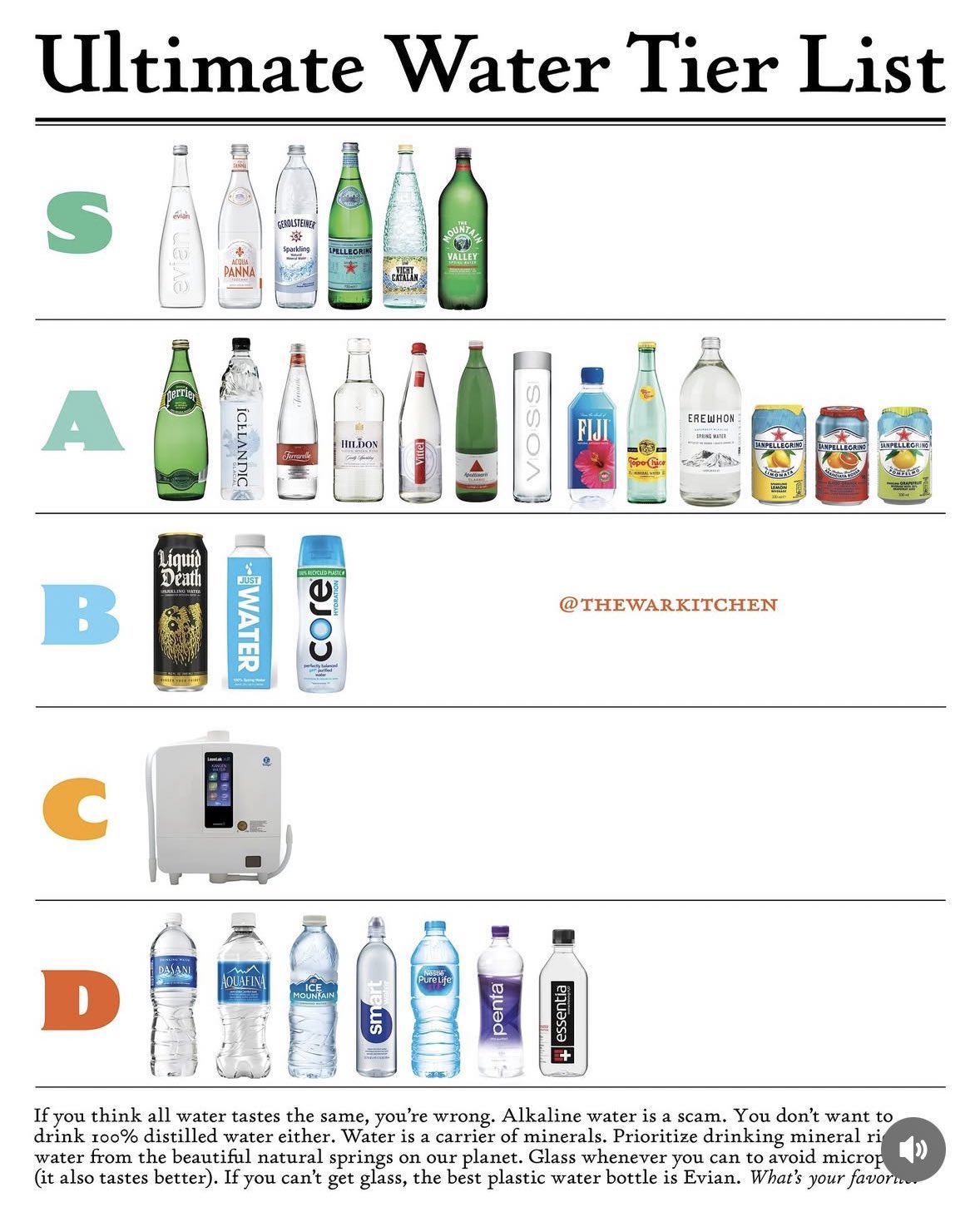
According to @thewarkitchen these are the best types of water.I personally have no idea how to rank water, I just...
Search for a command to run...