Protein chart: Animal VS Plant
Updated on
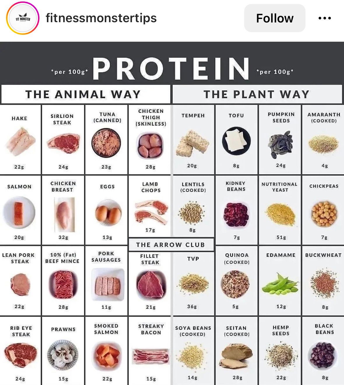
This visual from Fitness Monster Tips nails the basics of communication design. It takes a complex topic—protein content by food type—and turns it into a snackable chart anyone can “get” in seconds. No fluff, no endless scrolling. Just clarity.
Marketing Analysis
The chart splits foods into “The Animal Way” and “The Plant Way.” Both columns mirror each other so viewers can compare fast. The layout, bold headers, and photos make it effortless to skim. Even the “Arrow Club” label adds curiosity and a shareable hook.
Why It Works
- Uses contrast to simplify decision-making
- Visual hierarchy guides the eye naturally
- Category design (“Animal vs Plant”) invites identity-based engagement
- Shareable, educational, and saves users time
Examples
- HubSpot’s free tool comparisons use side-by-side simplicity for clarity.
- Fitbit’s infographics turn complex health data into visual stories.
- HelloFresh ingredient cards mirror this clarity in recipe form.
Analyzed by Swipebot
Loading analysis...
