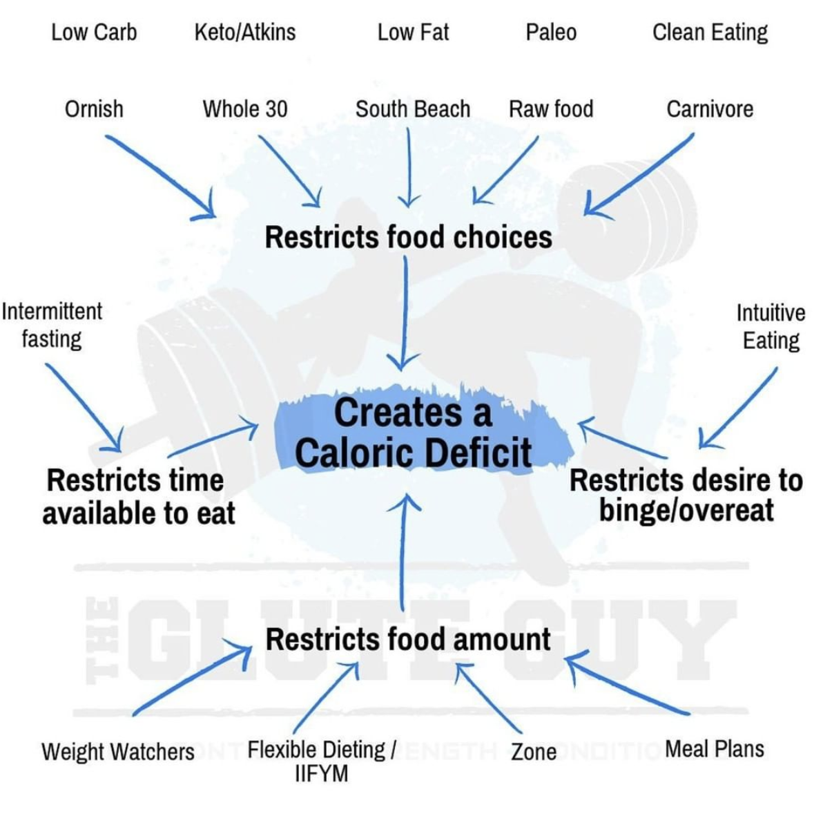
This image nails what most diet books take 200 pages to say: every diet works because it cuts calories. One clean visual, simple arrows, job done.
Marketing Analysis
This is marketing clarity in graph form. Instead of fighting for attention with long blog posts or debates, it shows the core truth visually. It’s the “show, don’t tell” rule, applied to information design.
Why It Works
- Strips away noise and goes straight to the core insight
- Visual = instant comprehension
- Reframes a confusing topic into a single, sticky message
- Makes the viewer feel smart for “getting it” instantly
Examples
- Airbnb’s one-slide pitch deck: simple and punchy
- Spotify Wrapped: summarizes complex data in one colorful chart
- Tesla’s range comparison ads: raw data, minimal words, instant clarity
Analyzed by Swipebot
Loading analysis...
