Simpsons ratings data easily displayed
Updated on
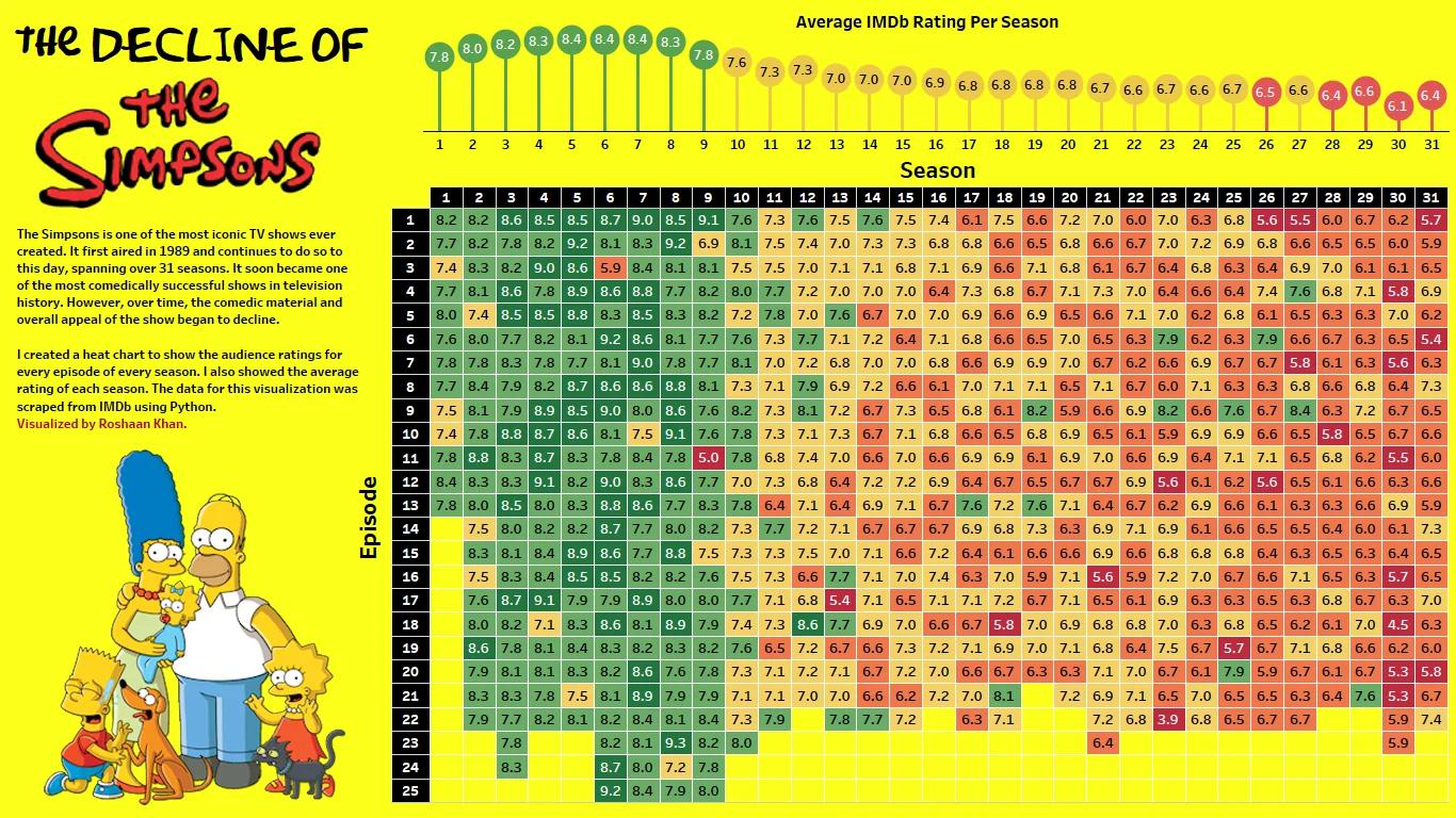
This heatmap of The Simpsons ratings is marketing gold. In one glance, you see how a cultural giant peaked, then slowly dipped into mediocrity. No fancy dashboard needed—just smart visual storytelling.
Why This Visualization Works
- Turns 30+ seasons of data into a simple color story: green = good, red = bad.
- Uses nostalgia (everyone knows The Simpsons) to pull in viewers.
- Emotionally powerful—seeing the “fall” makes you feel it, not just read it.
- Highlights trends instantly without a single sentence of explanation.
Real-World Examples
- Spotify Wrapped takes oceans of data and makes it feel personal and fun.
- Airbnb’s yearly host reports use clean, colorful data visuals to celebrate growth.
- LinkedIn career recaps simplify complex usage data into feel-good infographics.
Simple story + smart visuals = unforgettable message.
Analyzed by Swipebot
Loading analysis...
