
This is a cool graphic showing how the classic Excel Spreadsheet has been un-bundled by many companies. Similar to this Craigslist Unbundling graphing.


Love how this chart takes data from the top 7 movie ranking sources, then tallies them up for a final...

This image contrasts the downsides of overpaying executives—like drained resources and stalled growth—with the benefits of proper compensation, such as...
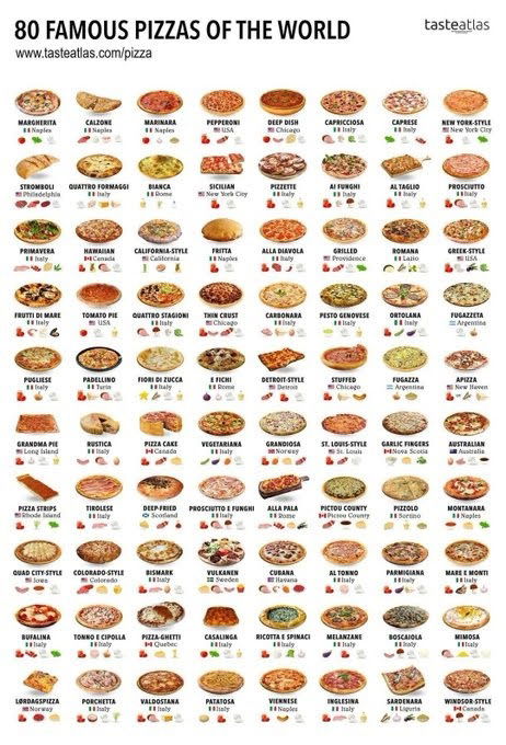
This chart takes 80 different pizzas, lists out where they’re from and also some other qualities about them. I like...

A simple chart with unemployment and "underemployment" rates by college major makes this data visually interesting by making the bar...

Fascinating chart showing the intelligence levels of Earth’s creatures — from humans capable of metacognition, all the way down to...

This chart shows how American went from bringing in revenue from manufacturing in 1990 to bringing in revenue from healthcare...
Search for a command to run...
Love how this chart takes data from the top 7 movie ranking sources, then tallies them up for a final...
This image contrasts the downsides of overpaying executives—like drained resources and stalled growth—with the benefits of proper compensation, such as...
This chart takes 80 different pizzas, lists out where they’re from and also some other qualities about them. I like...
A simple chart with unemployment and "underemployment" rates by college major makes this data visually interesting by making the bar...
Fascinating chart showing the intelligence levels of Earth’s creatures — from humans capable of metacognition, all the way down to...
This chart shows how American went from bringing in revenue from manufacturing in 1990 to bringing in revenue from healthcare...
Search for a command to run...