US Mountain Data Map
Updated on
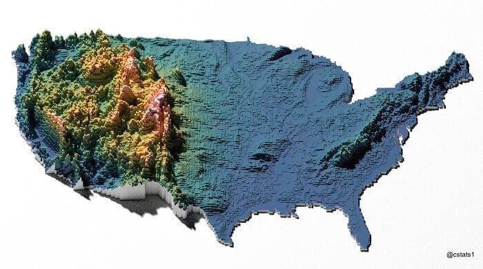
Most maps of the U.S. look flat and boring. But this 3D topographical map? It instantly shows you who’s got the mountain monopoly. Suddenly, the whole story changes.
Seeing Data Differently
The difference is simple but powerful: one map shows borders, the other shows meaning. The 3D version turns plain info into an aha moment by adding depth and color where it matters.
Why It Works
- It visualizes contrast instead of clutter
- It helps the brain “feel” scale and dominance
- It flips a common format into something memorable
- It tells a story without a single word
Examples
- Spotify Wrapped makes streaming data visual and emotional
- Zillow heatmaps show property prices at a glance
- Airbnb maps highlight hotspots of activity
- Google Earth made geography exciting again with 3D views
Analyzed by Swipebot
Loading analysis...
