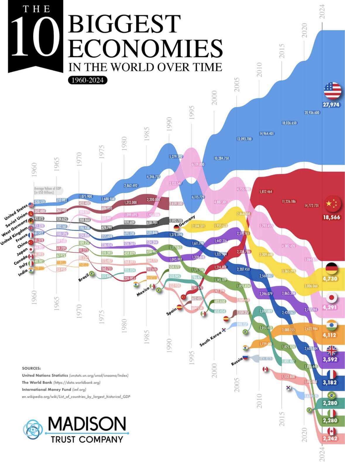
This chart isn’t just a lineup of GDP numbers. It’s a masterclass in visual storytelling. You can see economic dominance evolve — the USA’s consistent lead, China’s rocket-like rise, and others fading or holding steady.
Marketing Analysis
The design uses space, color, and movement to make a complex data story instantly clear. No explanation needed — your brain does the work before your eyes finish scanning.
Why It Works
- Big shapes show dominance at a glance
- Consistent colors make each country easy to follow
- Smooth flows make data feel like a living story
- Time on one axis makes growth and decline intuitive
Examples
- Spotify Wrapped visually shows listening trends growing or shrinking across time.
- LinkedIn “Career Journeys” graphics show simple, colorful timelines.
- Stripe’s annual reports turn complex financials into visual stories anyone can grasp.
Analyzed by Swipebot
Loading analysis...
