Acupuncture direct mail drop flyer
Updated on
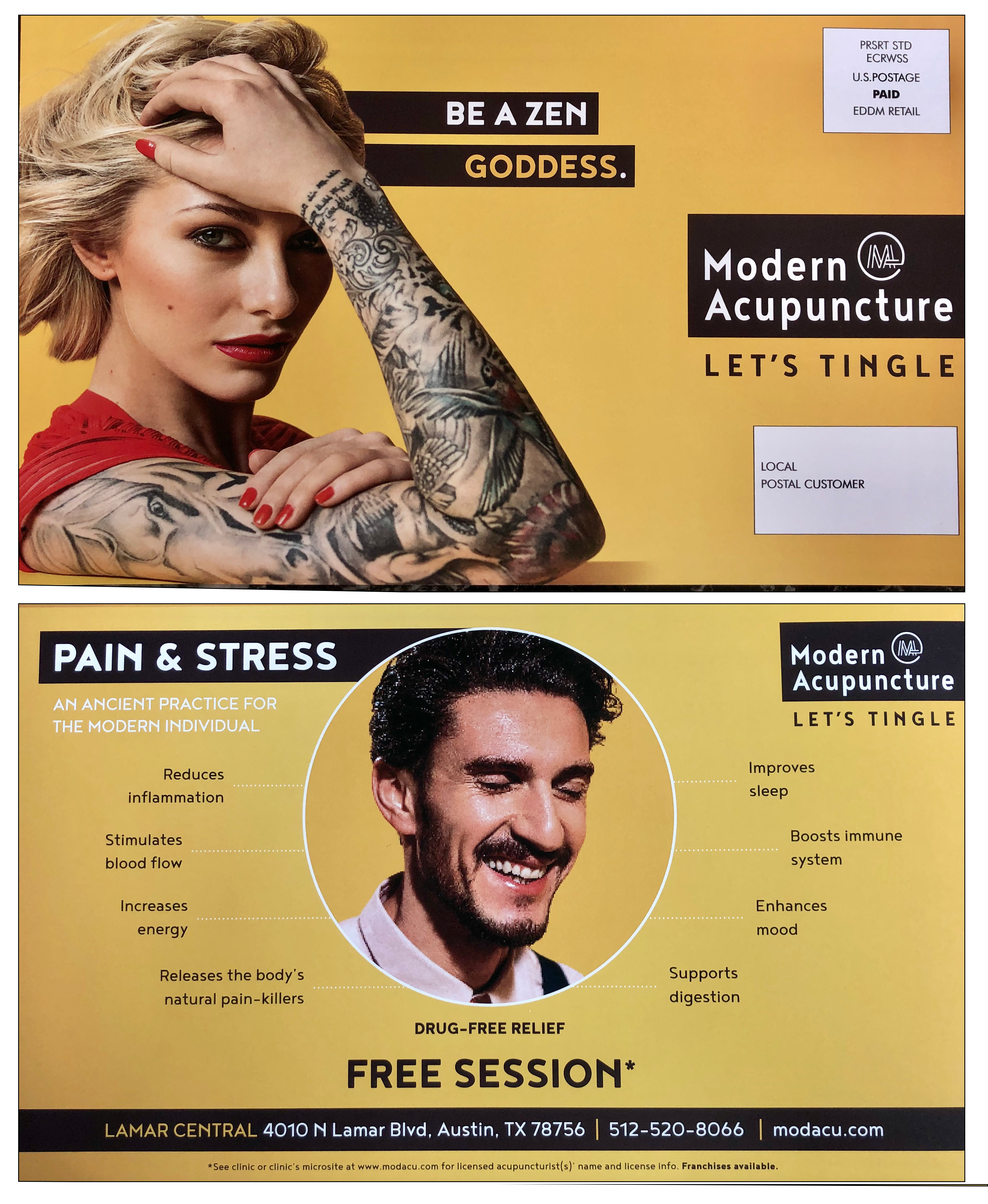
This direct mail piece from Modern Acupuncture nails attention with design backed by eye-tracking science. Bright colors, bold headlines, and human faces guide viewers exactly where the brand wants — name, offer, and benefit.
The Marketing Magic Behind the Design
The heatmaps show what gets noticed first: the logo, headline, and faces. That’s textbook visual hierarchy. The headline “BE A ZEN GODDESS” stops the scroll, while “FREE SESSION” closes the loop. Every visual cue pulls your eye toward the call to action without clutter.
Why It Works
- High-contrast colors = instant attention
- Faces create emotional connection
- Short, benefit-driven copy (“Drug-free relief”) frames value fast
- Clear hierarchy: logo → face → headline → offer
Real-World Parallels
- Orangetheory’s orange branding triggers instant brand recall
- Invisalign’s smiling faces boost conversion on social ads
- Sephora mailers use bold color blocks and minimal text for fast scanning
Analyzed by Swipebot
Loading analysis...
