Ad Professor Agency Homepage
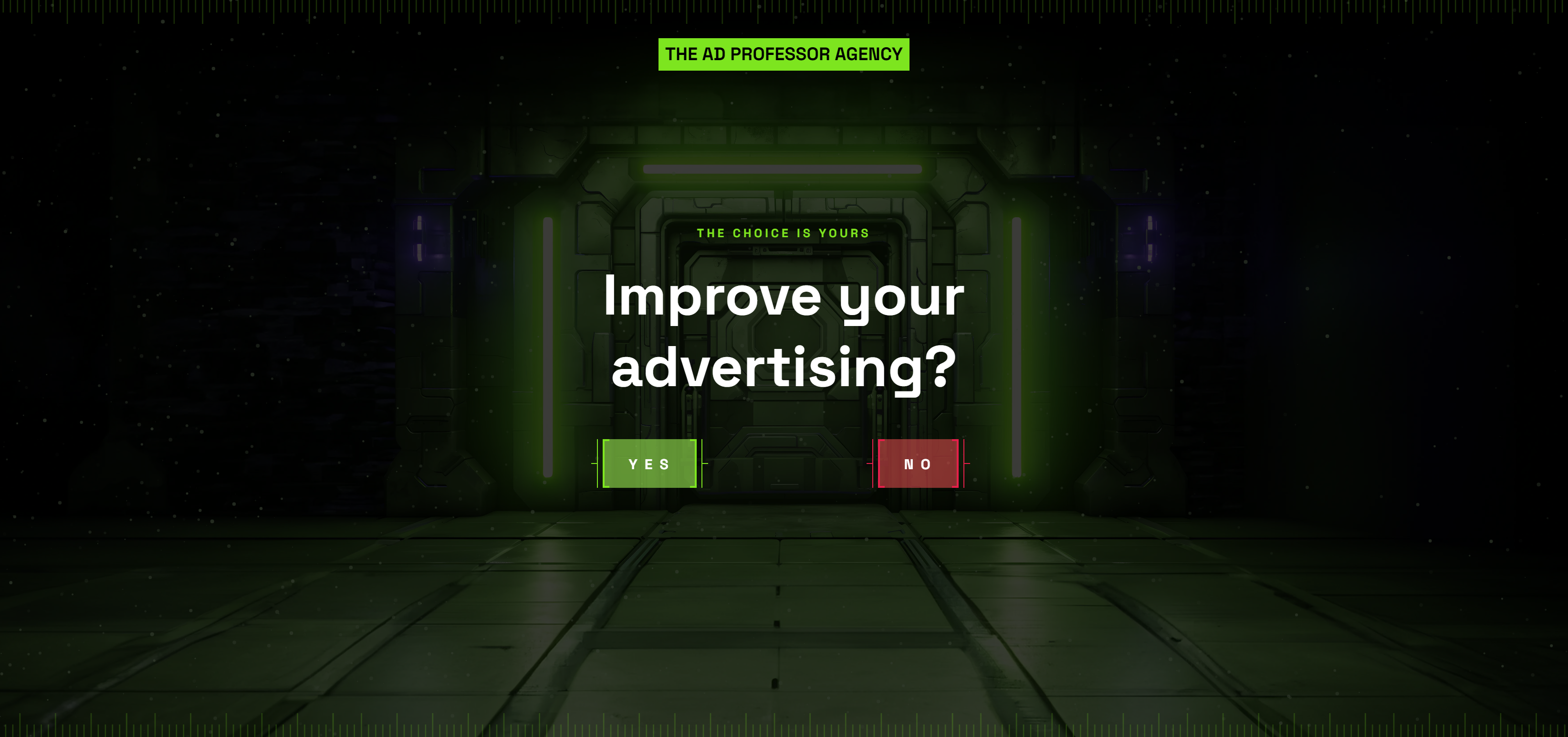
This homepage gives you only two choices: “Improve your advertising?” YES or NO. That’s it. No fluff. No scrolling. Just a bold question and two buttons. Feels like a sci-fi game start screen, and you can’t help but click.
Why it works
- Forces instant engagement with a binary choice
- Creates curiosity using a “mission start” vibe
- Taps into the loss aversion factor (who wants to click “No”?)
- Makes the benefit stupid simple: “improve your ads”
Real-world parallels
- Slack’s old “Be less busy” homepage simplified its value prop to one line
- Dropbox’s signup pages ask one clear question: “Try for free?”
- Apple’s “Buy” or “Learn more” buttons use the same binary frictionless flow
Analyzed by Swipebot
Loading analysis...
