The Website Complexity Trap
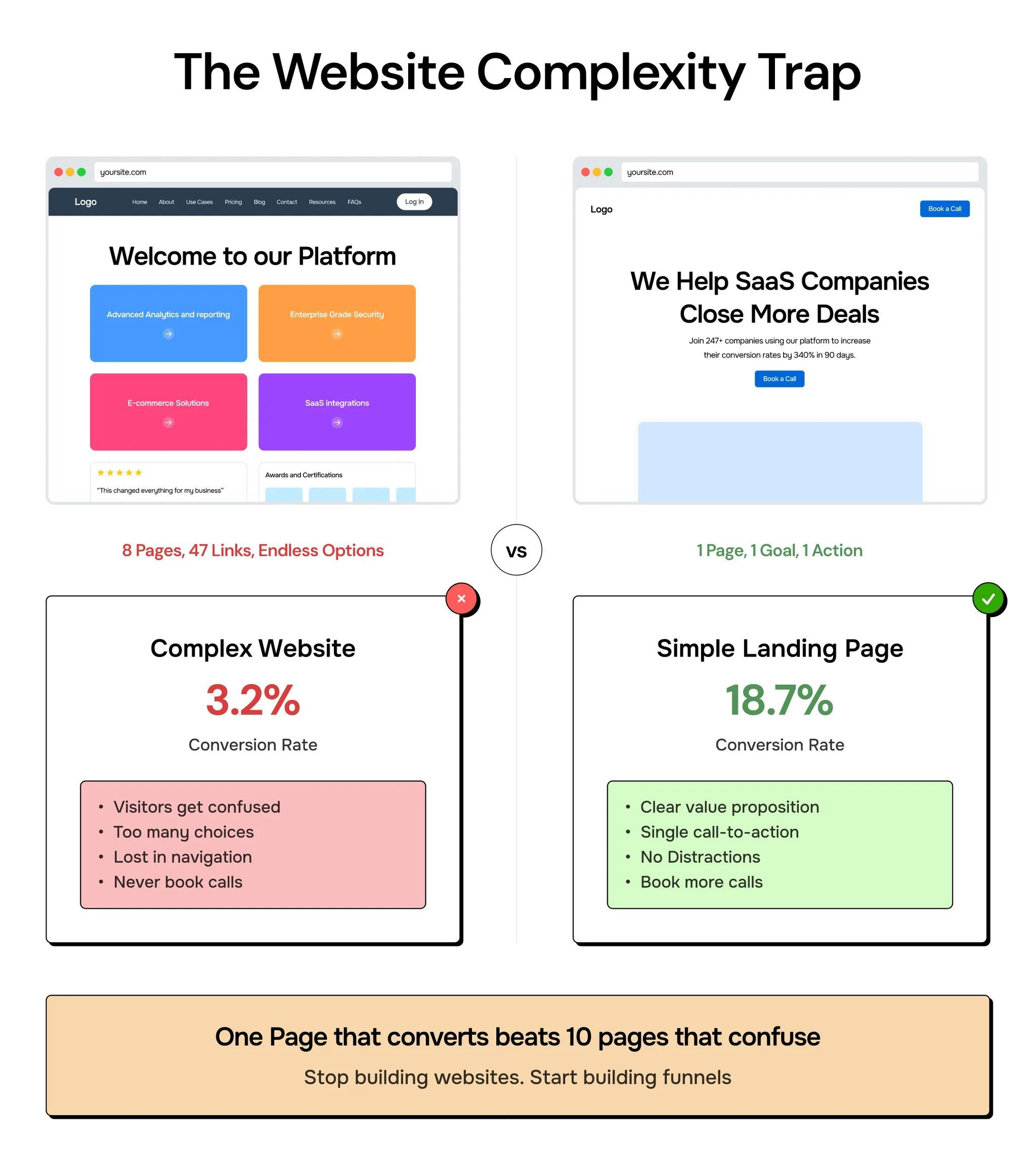
Namya from Supafast nails a core truth: most founders are overbuilding their websites. They think more pages look more “pro.” But the data says otherwise. The chart above shows a simple landing page out-converting a full site by nearly 6x.
Why simple beats fancy
- Fewer choices = fewer distractions (hello, Hick’s Law)
- One clear CTA reduces decision fatigue
- Simpler pages load faster and feel easier to use
- The message gets through without visual noise
Real-world examples
- Basecamp’s one-page site focuses on “calm productivity” and drives signups.
- Superhuman uses a minimalist, single CTA page to get users into demos.
- Gumroad’s founder famously ran million-dollar launches on plain-text pages.
Simple sells. Complexity often just impresses… other founders.
Analyzed by Swipebot
Loading analysis...
.png?width=3840&quality=80)