
This simple chart conveys Apple's multiple sources of revenue over time, all in an extremely easy color coded chart.
This image takes pages of financial data and makes it simple to consume!


This is a cool way to show the data of most popular grocery stores by state. Rather than a bar...
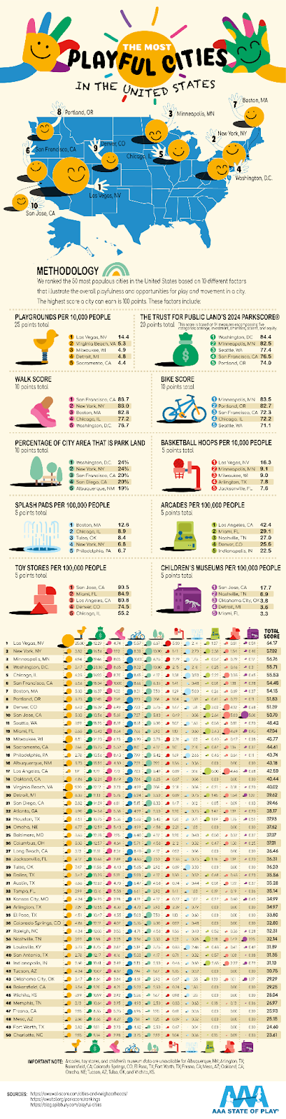
This pictograph illustrates the cities with the most playfulness by counting the number of playgrounds, splash pads, toy stores, walk...
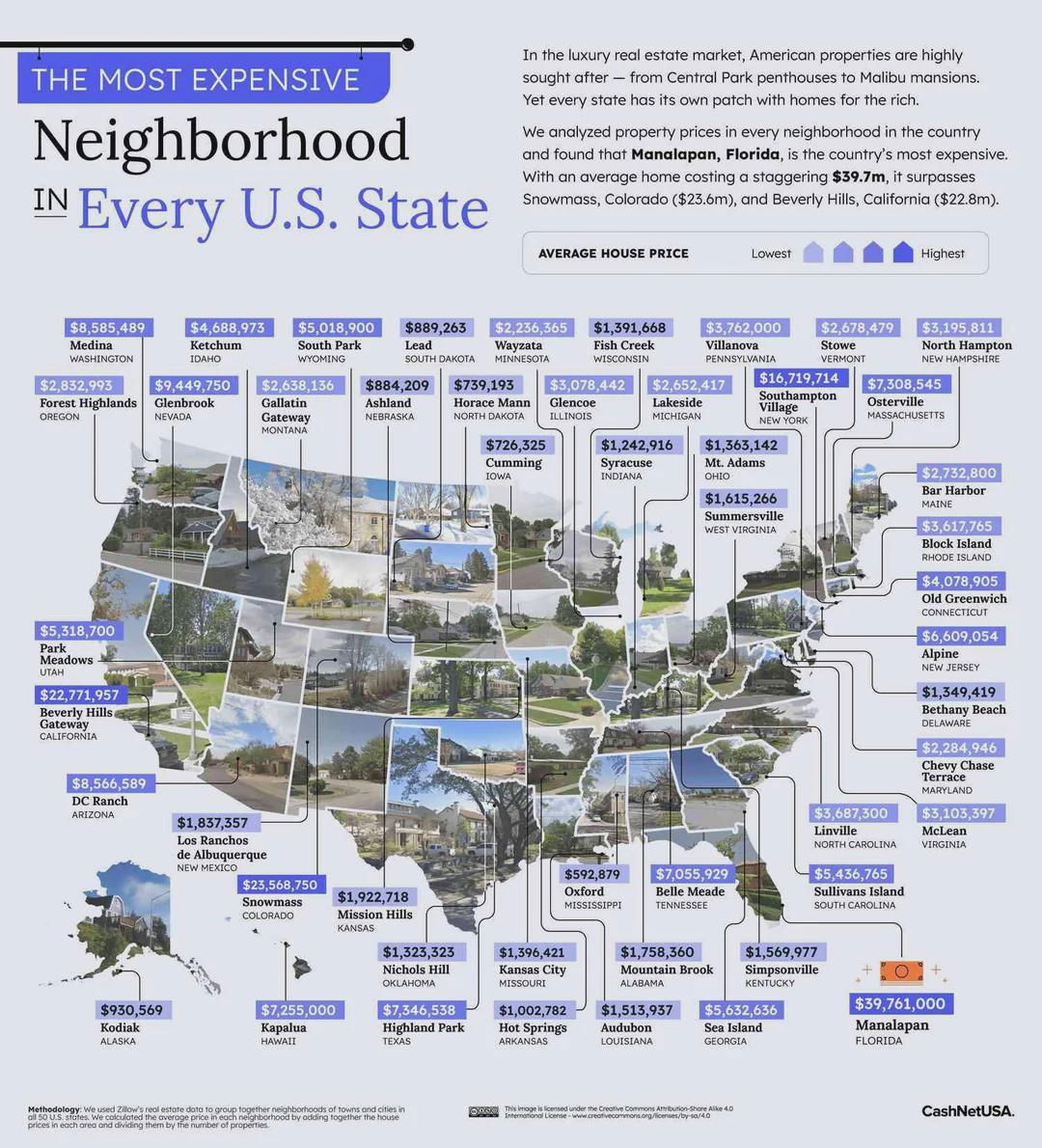
This is an interesting approach to listing out the most expensive neighborhoods in each state: By showing a map but...
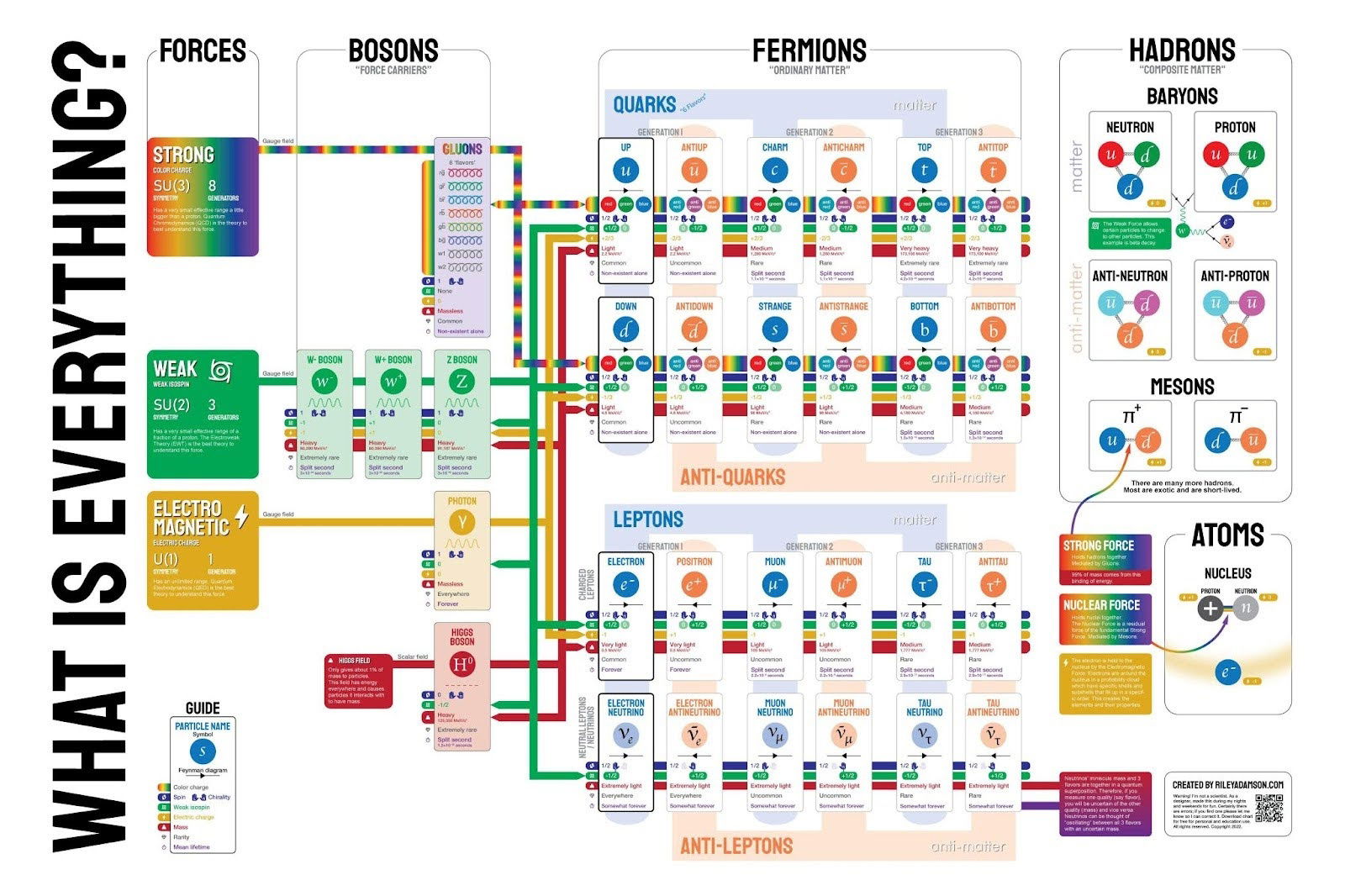
This isn't a very simple graphic, but it shows what everything is based down to the fundamental particles that we...

This treemap chart illustrates the proportions of chocolate exports from various regions around the world.
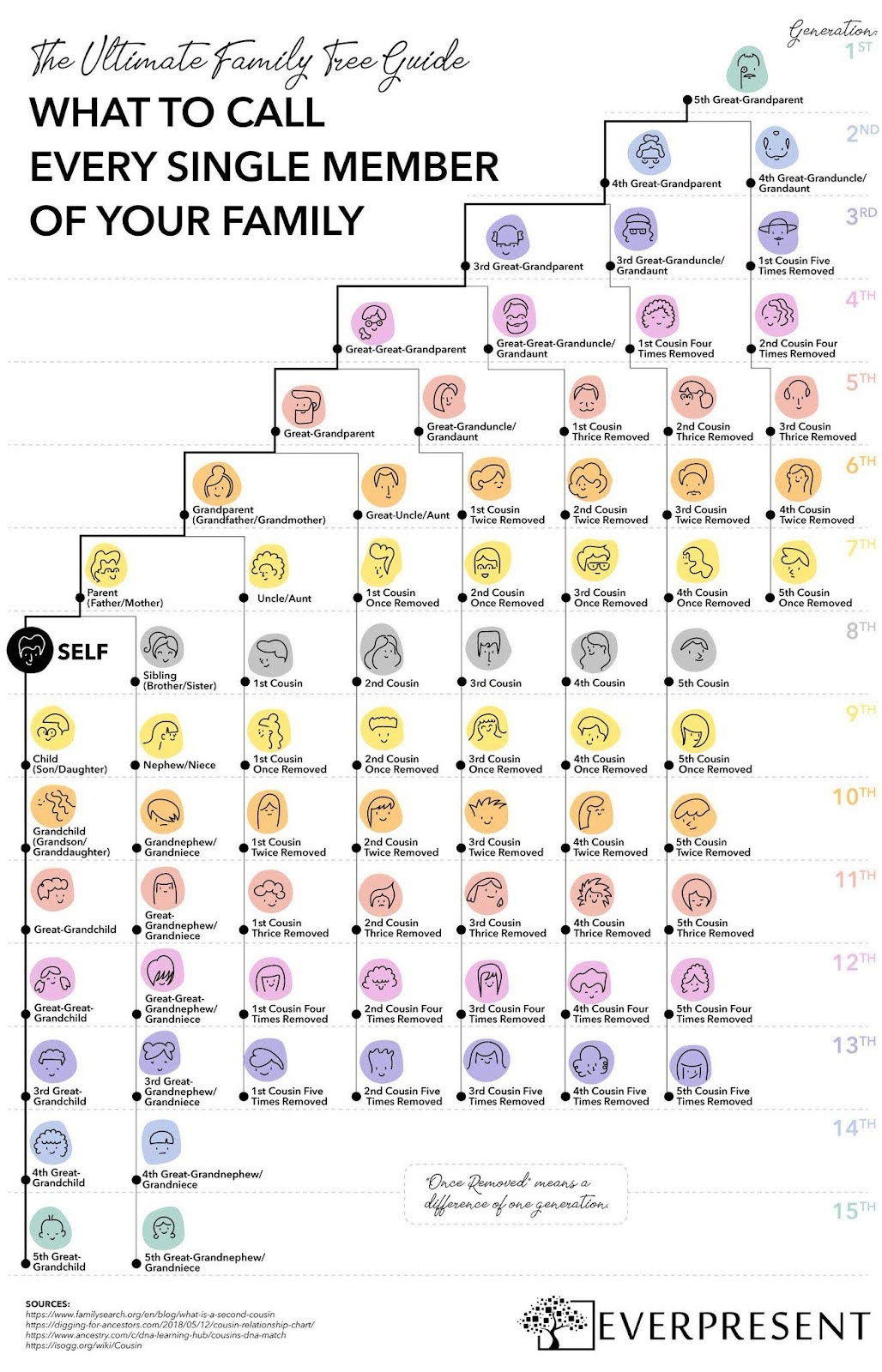
This colorful one-pager breaks down what to call every single family member—across 15 generations.
Search for a command to run...