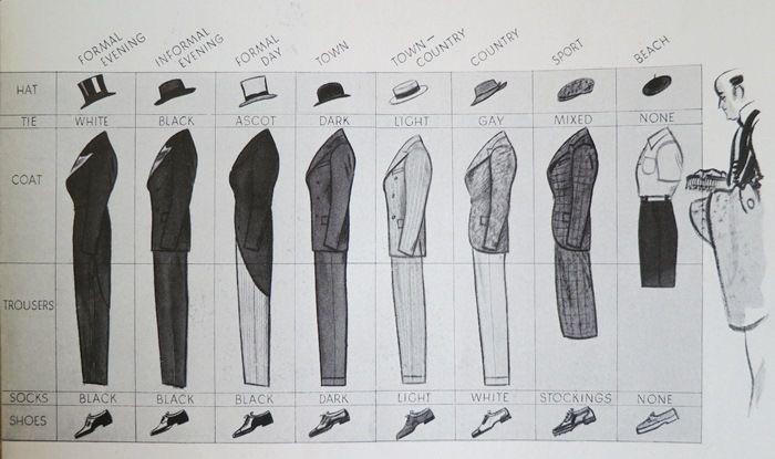
This 1920s men’s style guide is marketing gold in disguise. One image, zero fluff, and an instant understanding of an entire fashion system. That’s powerful communication.
Why This Visual Works
- Turns complex info (styling rules) into something instantly scannable
- Uses visual consistency to communicate hierarchy (formal to casual)
- Shows, doesn’t tell—people “get it” in seconds
- Leverages pattern recognition—repeat elements make it easier to follow
Other Great Visual Frameworks
- Airbnb simplified “hosts” vs “guests” roles with simple side-by-side graphics
- HubSpot’s flywheel visual replaced the old marketing funnel overnight
- Netflix’s “user journey map” visual explains their product experience in one slide
- Peloton’s app layout diagram makes complex fitness options feel intuitive
Sometimes the smartest marketing move is one perfectly clear picture.
Analyzed by Swipebot
Loading analysis...
.png?width=3840&quality=80)