1,139 Data Examples and Graph Examples
From analytics to consumer insights, see how data-driven decisions lead to successful campaigns. Essential for marketers, analysts, and business strategists.
Most Popular in Data

Free Newsletter Plan: When Paid Is Worth It
Free newsletter tools are awesome…until they quietly start costing you growth. That pricing table up there isn’t just about dollars,...
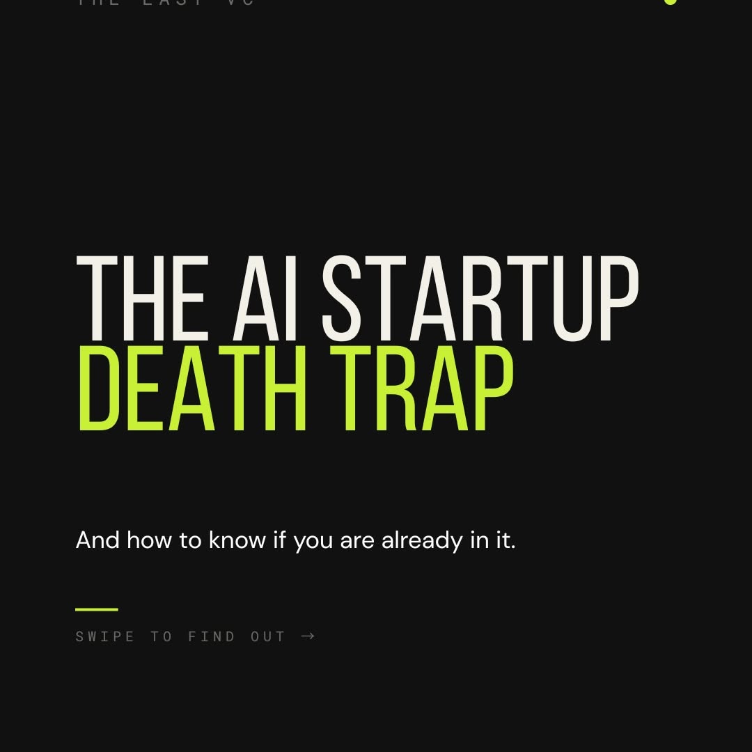
Features Are Demos; Workflows Are Moats
Most AI startups are accidentally building the world’s fanciest product demo. One model update later… poof. The feature they charge...
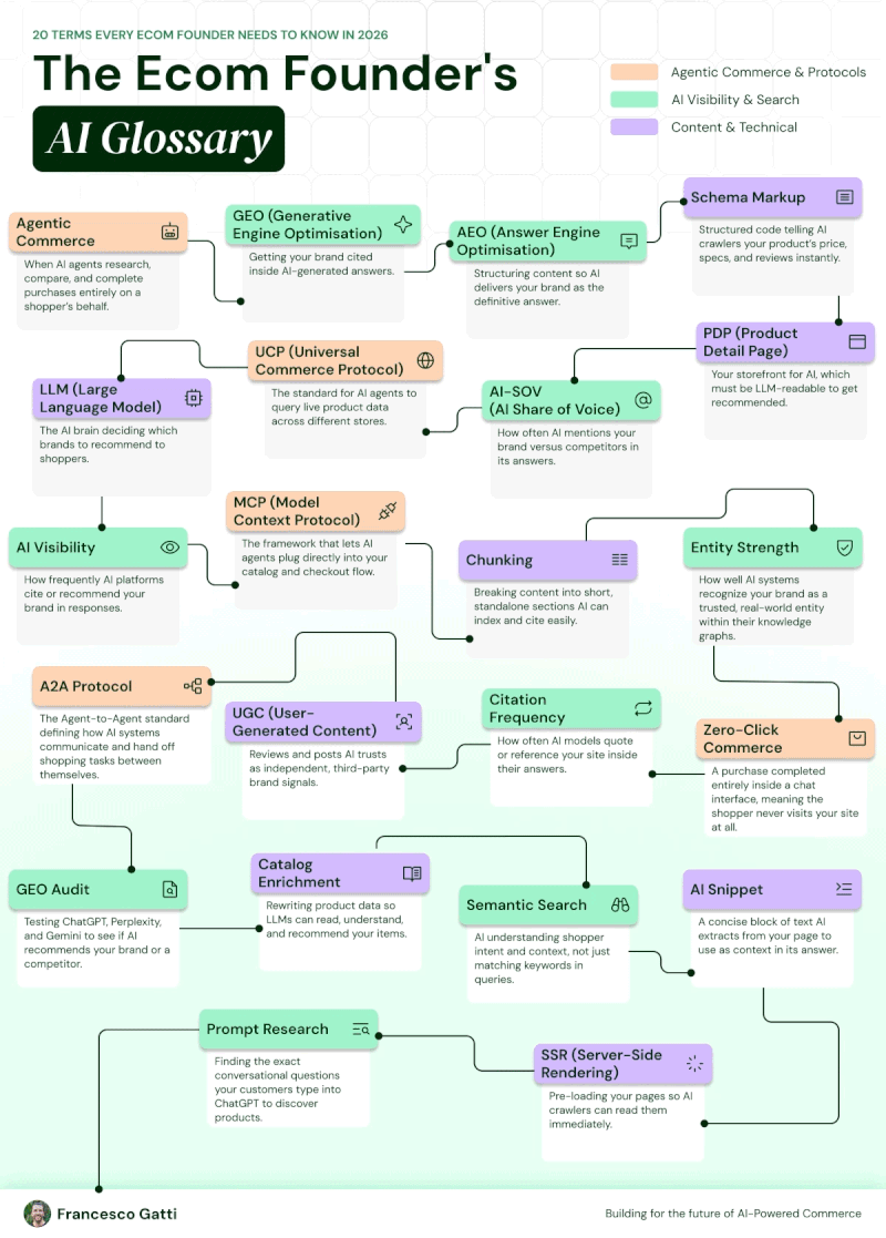
Ecom AI Glossary: 20 Terms to Win 2026
If you sell anything online in 2026, you’re not just running an ecommerce store anymore—you’re running an AI interface to...
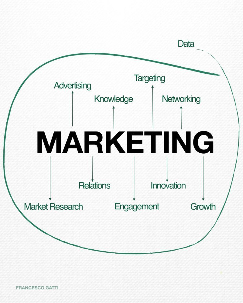
Marketing Mapped: Turn Data Into Growth
This simple diagram nails what most dashboards miss: marketing is not a pile of metrics, it’s a system. Data sits...
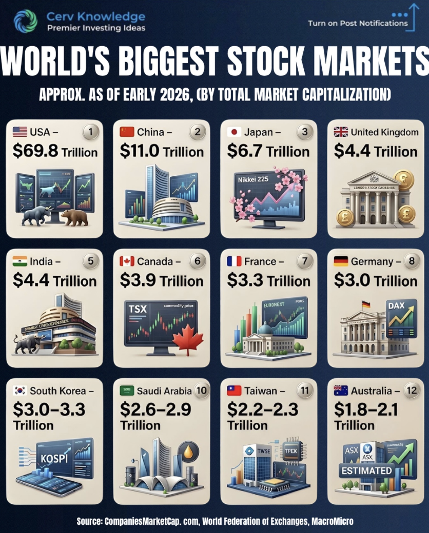
Top 12 Exchanges That Move Global Capital
This visual of the world’s biggest stock markets is basically a map of where global money sleeps at night. In...

Alex Hormozi: Scale Right Or Scale Twice
Scaling feels sexy when you’re on stage bragging about revenue. The image shows a muscled speaker smiling on stage while...
Best money I've ever spent as a CEO... an internal AI transformation hire.
He doesn't care about title. He just wants to ship. And he goes across your entire org, sales, revenue, hr, apps, tech and kills stupid manual processes.
Such an...
The One AI Hire That Kills Manual Work
Most companies are spending on more headcount when they really need one killer AI operator. Not a fancy “Head of...
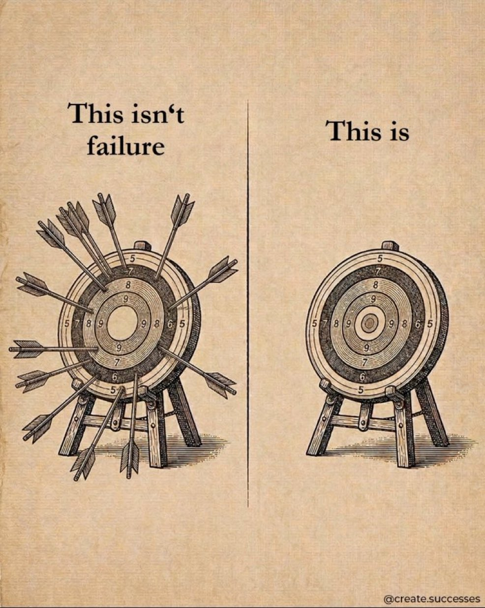
Taking Shots Beats Not Shooting
The image shows two targets: one shredded with arrows, one perfectly clean. The caption flips our usual script: the messy...
8 Moats That Make Software Companies Endure
Most software dies not from competition, but from having no real moat. These 8 moats keep competitors sweating while your...

The US needs 500,000 new electricians this decade.
Apprenticeships take 5 years.
Microsoft’s Brad Smith says it’s the #1 thing slowing data center expansion.
The AI bottleneck isn’t chips. It’s the trades.
AI’s Next Crisis: A 500K Electrician Shortage
Everyone’s obsessing over GPUs, but the real AI choke point is wearing a tool belt, not a lab coat. Data...

If You Hit $1M You're Crushing It
The chart in this tweet should be stapled above every founder’s desk. Out of 28 million firms, 96 percent never...

Points Transfer Cheat Sheet: Card Partners & Timing
This Points Transfer Cheat Sheet turns that giant, confusing mess of airline partners and transfer times into one clean, scannable...

Donut Calorie Cheat Sheet: Dunkin vs Krispy Kreme
Donuts are tiny circles of joy… and sneaky circles of calories. This cheat sheet lines up Dunkin vs Krispy Kreme...

9-Step Playbook to Make Processes AI-Native
Most teams jump straight to playing with models and wonder why their AI project stalls. The image breaks down a...

The 8% Return Illusion Exposed
The image smacks you with the truth: the neat 8 percent line your broker loves is a fairy tale. On...

Be Contrarian, Expect to Look Stupid
Freeze-frame the reel: a founder sits calmly, subtitle across his chest saying, "they would hang up on me." No pitch...

Exact Nest-Egg Targets for 3%, 4%, 5% Withdrawals
This visual nails the question every future retiree secretly Googles: How big does my nest egg actually need to be?...
I scraped the Hampton Slack for book recs
1,000+ founders, 18 months of data.
Here's what people who’ve built companies are reading:
Psychology of Money - Housel
Die With Zero - Perkins...
What 1,000 Founders Actually Read
Scrape 18 months of a private founder community and you do not get fluffy airport books. You get what 1,000...

Focus On One Project For Real Progress
This chart punches you in the face with a simple truth: the green dot wins. One project gets almost all...


Highlight One Metric To Stand Out
If everything is important, nothing stands out. This visual nails a simple marketing move: pick one number, make it impossible...

Huge Untapped Markets for Retail Investing
This chart is screaming one thing: most of the world still does not invest in stocks. While over half of...

Prioritize Location: Reviews Rival Paid Ads
This donut chart screams one thing: local buyers care where you are and whether people trust you. Location dominates conversions,...
One of my favorite lessons I’ve learnt from working with smart people:
Action produces information. If you’re unsure of what to do, just do anything, even if it’s the wrong thing. This will give you information about what you should...
Ship Fast, Learn Faster
Most people wait for clarity before they move. The pros move to create clarity. “Ship fast, learn faster” is how...
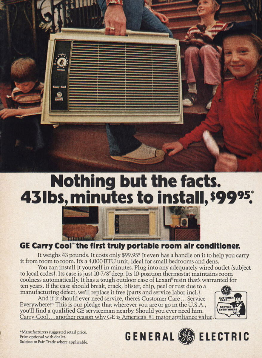
Lead With Exact Numbers, Not Hype
This GE Carry Cool ad is a masterclass in killing hype with cold, hard numbers. No “revolutionary comfort solution” nonsense....