Human History Chart
Updated on
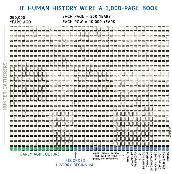
Ever feel like marketing isn’t moving fast enough? This chart from Wait But Why crushes that illusion. It shows human history as a 1,000-page book—where 99% of pages are blank until the very end. All our biggest achievements? They’re packed into the last few lines.
Marketing Analysis
This chart nails one thing: perspective. It instantly reframes scale and speed, turning abstract time into something you can feel. That’s the power of visualization—it makes people go “whoa” without needing paragraphs of explanation.
Why It Works
- Shows huge data in a single, simple visual
- Mixes logic (data) and curiosity (storytelling)
- Uses contrast: blank vs tiny colored sections
- Pushes emotional triggers like urgency and pride
Examples
- Wealthsimple’s growth charts showing slow compounding.
- Airbnb’s timeline visual from idea to global reach.
- Tesla’s progress chart comparing EV adoption rates.
- Spotify Wrapped turning listening history into time perspective.
Analyzed by Swipebot
Loading analysis...
