Evolution of the Alphabet chart
Updated on
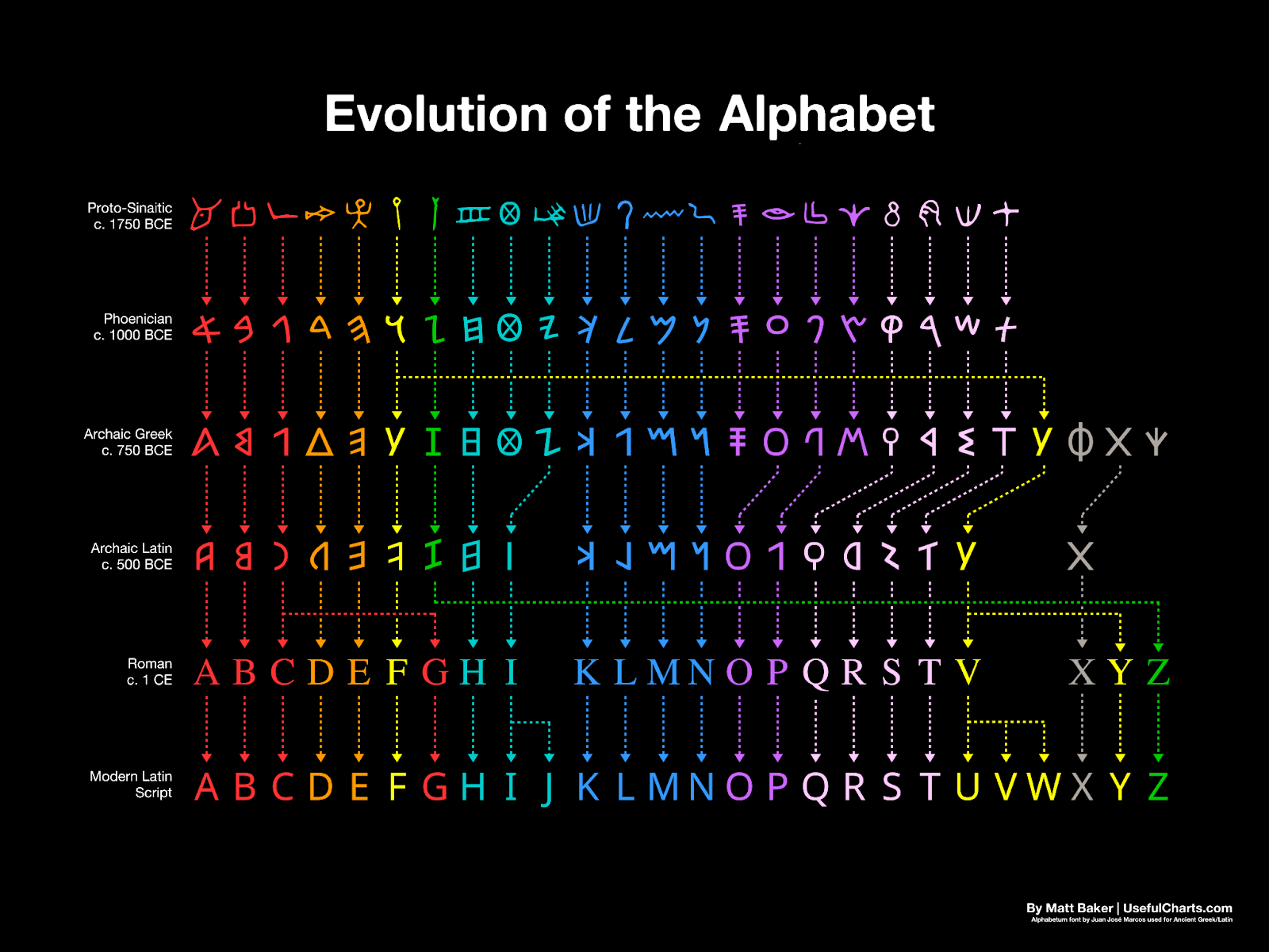
This chart shows the wild evolution of our alphabet—from ancient squiggles to the clean A-Z we know today. It’s a visual reminder that even the most fundamental systems adapt over time.
Marketing analysis
Your message, like the alphabet, needs to evolve to stay relevant. Each line in this chart represents incremental improvement, simplification, and adaptation to new audiences—a lot like copy that gets tested and refined.
Why it works
- Shows progression clearly and visually
- Connects complexity to simplicity
- Uses color to differentiate stages
- Feels authoritative yet accessible
Examples
- Coca-Cola’s logo tweaks over 100+ years show subtle evolution, not overhaul.
- Google’s logo shifted fonts five times to stay current while staying recognizable.
- Mailchimp’s branding updates in 2018 simplified visuals without losing its quirky vibe.
Analyzed by Swipebot
Loading analysis...
.png?width=3840&quality=80)