Oura Ring featured metrics ad
Updated on
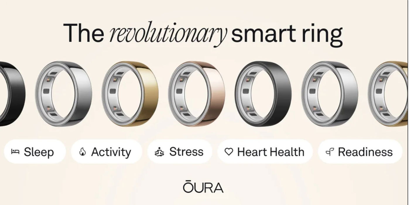
This Oura Ring ad is clean, classy, and laser-focused. It doesn’t scream features or technical specs. Instead, it taps straight into what people want to improve.
Marketing analysis
The layout is smart: six sleek rings across the top, and below them, five neat bubble icons labeled with emotionally charged outcomes like “Sleep,” “Stress,” and “Heart Health.” Each bubble acts as a mini trigger to catch different customer motivations within one glance.
Why it works
- Uses emotional benefit-first labeling
- Visual variety lets viewers imagine ownership
- Simple language keeps focus on results, not tech
- Multiple entry points for different user goals
- Clean, uncluttered aesthetic builds trust
Examples
- Apple Watch ads highlight fitness, ECG, and sleep separately.
- Calm’s landing page targets stress relief and better sleep.
- Fitbit marketing focuses on “Move, Sleep, and Eat better.”
- Peloton ads show “Energy, Motivation, and Community” outcomes.
Analyzed by Swipebot
Loading analysis...
