Funny “we need a graphic designer” crappy ad
00:00
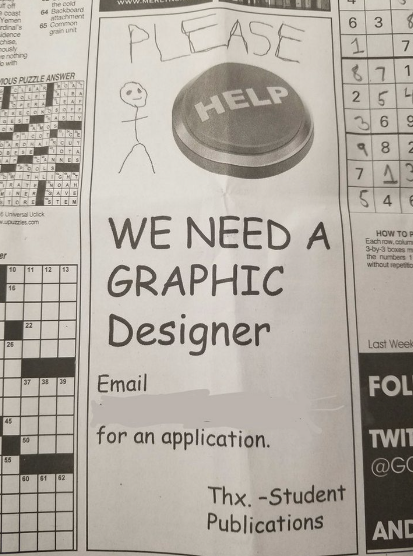
This ad looks like it was made in Microsoft Paint by someone’s grandpa. And that’s why it works. The terrible design is the joke — and the message (“we need a graphic designer”) lands instantly.
Why this works
- Pattern interrupt: In a sea of polished ads, ugly grabs attention.
- Instant clarity: You get the message in one second.
- Humor as a hook: Makes readers laugh and understand the need.
- Authenticity: Feels human, not overproduced.
Real-world examples
- The “World’s Worst Resume” stunt by Canva that went viral.
- Dollar Shave Club’s low-budget ad that exploded on YouTube.
- Wendy’s roast-style tweets grabbing massive engagement.
- Old Spice’s over-the-top commercials relaunching a sleepy brand.
Sometimes being intentionally bad is the best way to get noticed.
Analyzed by Swipebot
Loading analysis...
