Great Us -VS- Them Instagram ad
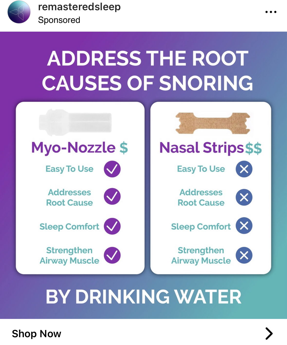
A headline that says “Address the root causes of snoring by drinking water” makes anyone with a snoring problem instantly curious. Then, the ad hits them with a clean side‑by‑side comparison that crushes the standard nasal strip.
Why It Works
- Opens with a curiosity hook that ties to a relatable pain point
- Visual comparison makes the buying decision easy
- Reframes the product as addressing the root cause, not a symptom
- Uses clear, scannable checkmarks for instant understanding
- Color contrast (purple vs. beige) highlights the product’s superiority
Real-World Examples
- Apple vs. PC ads—simple side‑by‑side comparisons made Apple cool
- Dollar Shave Club compared $2 blades to overpriced store brands
- Slack shows “before vs. after” chaos-to-clarity comparisons
- Peloton uses side‑by‑side ROI visuals to justify premium pricing
Analyzed by Swipebot
Loading analysis...