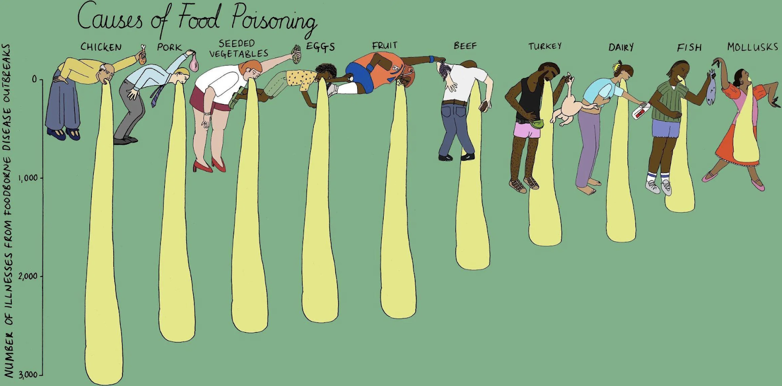
This “Causes of Food Poisoning” chart is pure genius. It transforms a boring data set into a visual gag that’s impossible to ignore. Instead of dry bars, the data is literally puking people. Gross? Yes. Memorable? Absolutely.
Why it works
- It surprises the viewer, triggering instant attention.
- It uses humor to make uncomfortable info stick.
- It simplifies complex stats into a single funny visual.
- It humanizes the data with characters instead of numbers.
Real-world parallels
- Spotify Wrapped turns data into personal stories and graphics.
- Infographics by Wait But Why use drawings to explain science.
- Dollar Shave Club’s launch video used absurd humor to make boring razors fun.
- Mailchimp’s quirky graphics made email software lovable.
Analyzed by Swipebot
Loading analysis...
