Neville college website
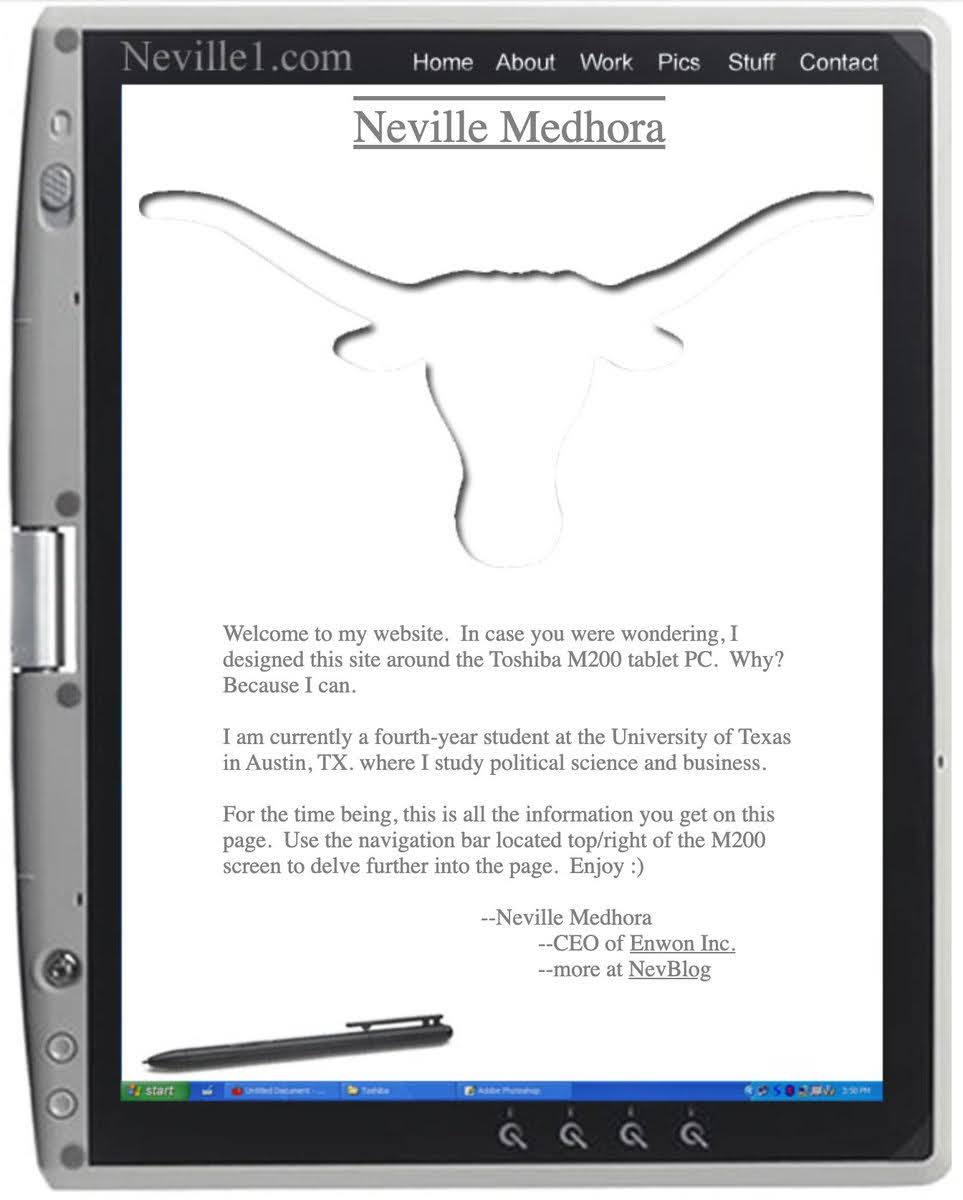
Back when most student websites were boring resumes, Neville Medhora made something personal and fun. His old site looked like a tablet PC (meta!), included a Texas Longhorn logo, and even told visitors how to use the navigation bar.
Marketing analysis
Neville wasn’t just showing his work—he was showing who he was. The tone felt like a conversation, not a pitch. The design showed creativity. The instructions made it easy to use. It screamed confidence without needing fancy features.
Why it works
- Personality builds trust fast
- Clear navigation removes friction
- Humor makes people remember you
- Positioning yourself as resourceful = instant credibility
Examples
- Dropbox’s early explainer video used humor to grow signups 10x
- Dollar Shave Club’s launch video mixed wit and clarity—12,000 orders in 48 hours
- Mailchimp’s playful UX voice turned boring email tools into a loved brand
Analyzed by Swipebot
Loading analysis...
