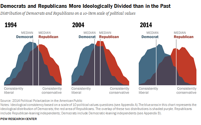
Image Description
The image is a chart illustrating the increasing ideological divide between Democrats and Republicans in the United States from 1994 to 2014. It shows the distribution of political values on a scale from consistently liberal to consistently conservative, with notable shifts in the median positions of both parties over time.
Positive Aspects
This chart is a powerful visual tool that clearly illustrates the trend of growing political polarization in the US. By showing the shift in medians over two decades, it provides a concrete, data-driven representation of what is often discussed in abstract terms. The color-coded areas help distinguish between the ideological leanings of Democrats and Republicans, making the information easily digestible.
Key Takeaways
- Visual Clarity: The chart effectively visualizes the shift in political values among Democrats and Republicans from 1994 to 2014.
- Increasing Polarization: It highlights the growing ideological divide between the two parties, with both moving further apart over time.
- Data-Driven Insight: Provides a concrete representation of political trends that are often discussed in vague terms.
- Historical Context: Offers a snapshot of political changes over two decades, useful for understanding current political dynamics.
Additional Insights
Political polarization affects not just political discourse but also social dynamics, leading to echo chambers and reduced bipartisan cooperation. This chart could spark discussions about the impact of media, social networks, and policy decisions on these trends. Understanding these divisions is crucial for addressing the challenges of governance and public policy in a polarized environment.