Social media scheduler does a good job using graphics to describe service
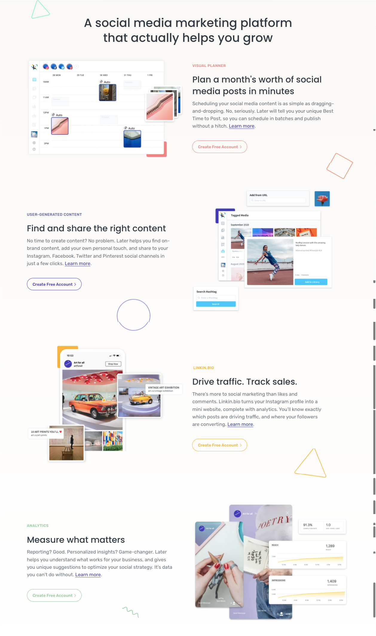
This is a masterclass in feature-benefit pairing with clear visuals. Each section of Later’s landing page shows the product doing what it claims—no imagination required.
The Smart Move
They don’t just list features like “visual planner” or “analytics.” Each chunk pairs a short, benefit-led headline (“Plan a month’s worth of social posts in minutes”) with an image of that exact feature in use.
Why It Works
- Shows how the product solves pain points
- Keeps copy simple and visually supported
- Self-explanatory graphics reduce cognitive load
- Repeats clear calls to action after each section
Real-World Examples
- Notion’s templates page shows its layouts in real use cases
- Shopify’s homepage features demo stores to visualize results
- Canva uses editable previews instead of static screenshots
- Trello’s feature illustrations mirror real workflow boards
Analyzed by Swipebot
Loading analysis...
