Tesla Interior Refreshes and Simplicity
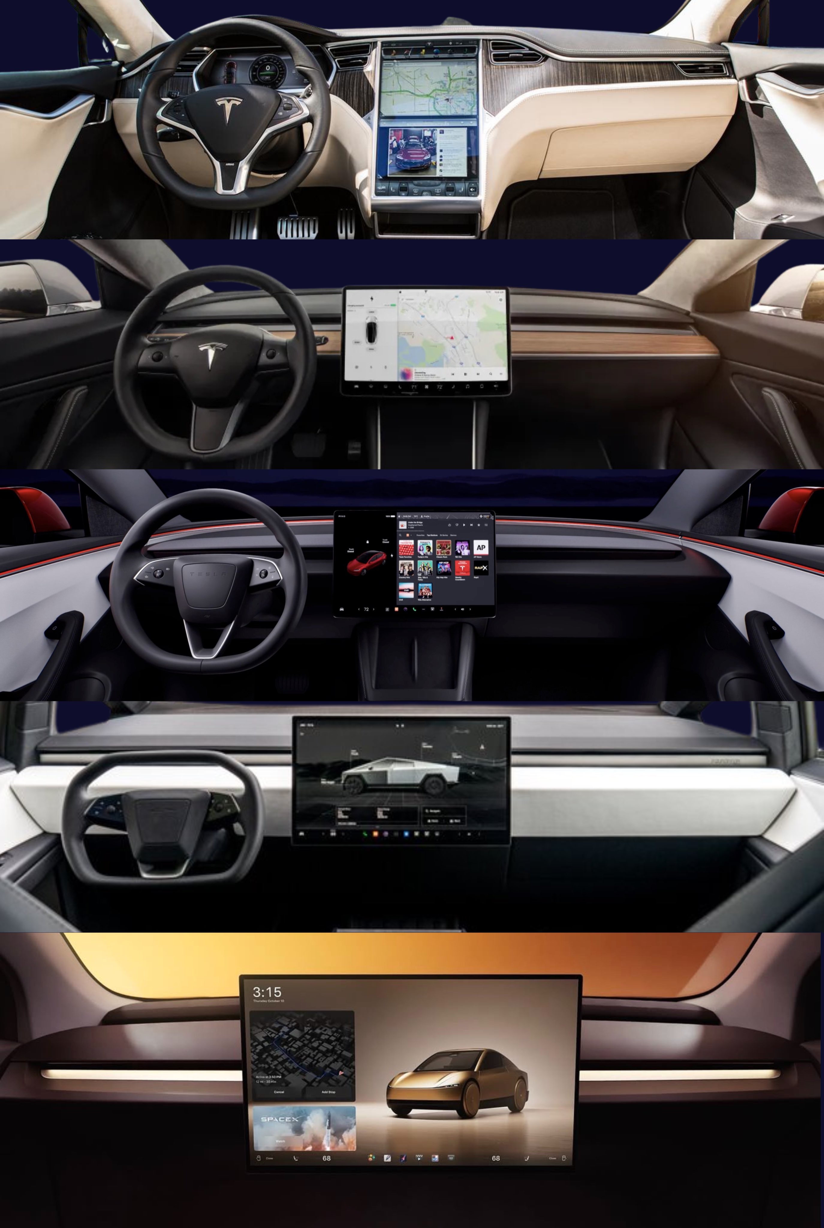
Tesla interiors started with buttons everywhere. Over the years, they’ve stripped it all away—leaving one big touchscreen and a clean, futuristic look. This visual shows the march from clutter to calm.
The Marketing Behind the Minimalism
Tesla isn’t just simplifying design—they’re simplifying perception. Fewer knobs and switches make the brand feel cutting-edge, effortless, and premium. This tells a story: “We’ve automated the clutter out of your life.”
Why It Works
- Simplicity signals innovation and confidence
- Clean design reduces cognitive load = more trust
- Focus moves to the experience, not the hardware
- Differentiates Tesla from legacy “button-heavy” brands
Real-World Parallels
- Apple killed the keyboard on phones—created iPhone magic
- Netflix removed DVD menus—instant streaming simplicity
- Uber ditched forms—one tap, ride arrives
Simple sells. Always has. Always will.
Analyzed by Swipebot
Loading analysis...
