SwipeFile Signup A/B Split Test
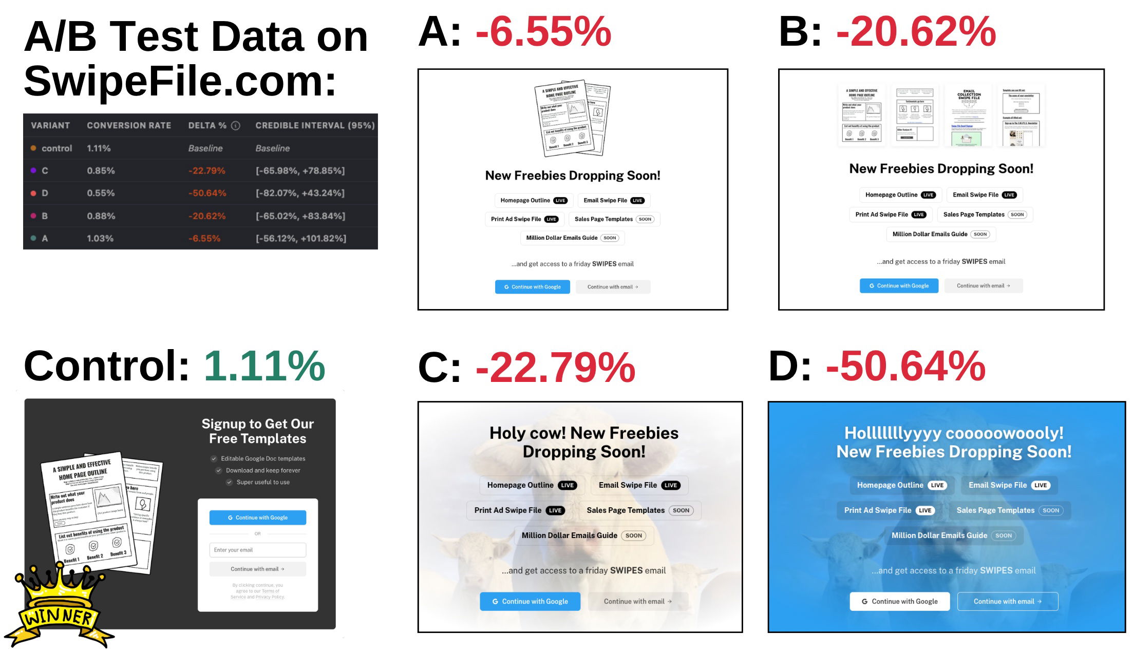
Sometimes the ugly duckling is already a swan. SwipeFile.com ran a 3-week A/B test on their signup form, trying four fresh designs to beat a 1.11% site-wide conversion rate. Every single one bombed. The control kept its crown.
The marketing lesson
The “losers” remind us that polish and novelty aren’t the same as performance. The control worked because it was stupid simple: clear headline, visible benefit, minimal friction.
Why it works
- Clarity beats cleverness—people want to understand, not decode.
- Familiar layouts reduce cognitive load.
- Fewer distractions keep attention on the conversion action.
- The benefit (“free templates”) is specific and tangible.
Other brands showing this
- Basecamp’s plain-text homepage outperformed flashy redesigns.
- Dropbox simplified its landing page and doubled signups.
- Buffer’s plain email opt-in outran its “creative” ones by 40%.
Sometimes your “boring” version is just what works.
Analyzed by Swipebot
Loading analysis...
