
Inflation is a hard concept to explain….but this simple picture really “shows” it perfectly!
It’s easy to see how much the buying power of the dollar has decreased in ~100 years by seeing the giant stack of money -vs- a few bucks in 1933.


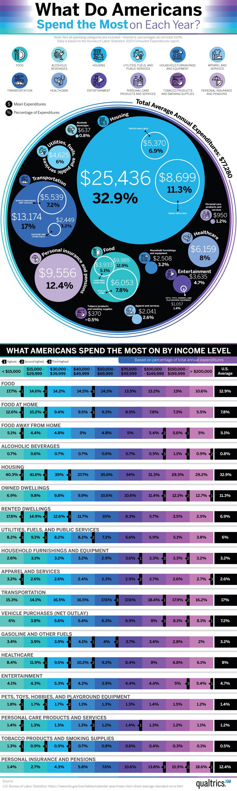
Here is where Americans actually spend their money. This chart also breaks it down by income level
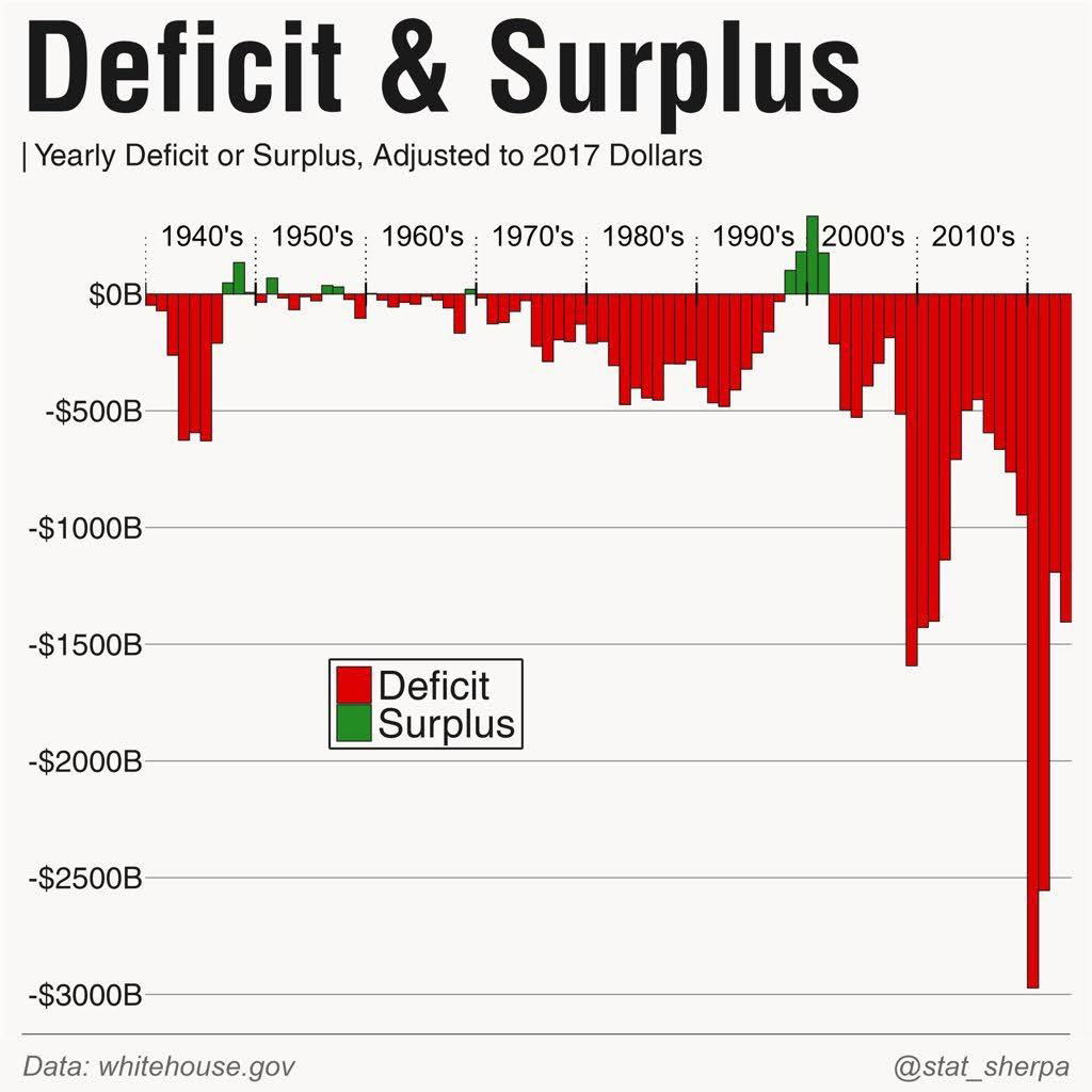
Graph showing the yearly deficit or surplus since the 1940's. This is a wild-looking graph because you can see, pretty...
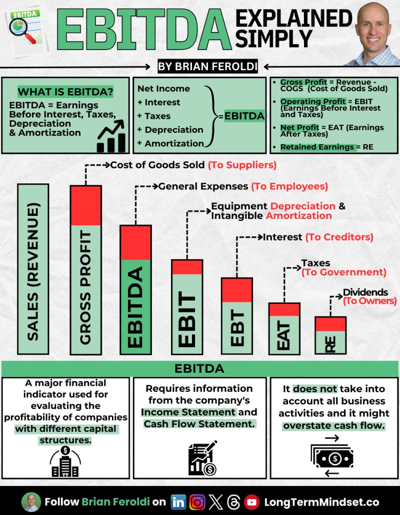
Warren Buffet and Charlie Munger famously hated the "EBITDA" method of calculating profit, because it doesn't account for allllll the...

This graph illustrates the number of downloads needed to rank #1 on the app store.app store.

Cool before and after photo of a house getting completely remodeled from the outside with some paint and different doors/windows.Image...

I saw this post and what I liked about it was that it was screenshot-able. This means it’s a lot...
Search for a command to run...
Here is where Americans actually spend their money. This chart also breaks it down by income level
Graph showing the yearly deficit or surplus since the 1940's. This is a wild-looking graph because you can see, pretty...
Warren Buffet and Charlie Munger famously hated the "EBITDA" method of calculating profit, because it doesn't account for allllll the...
This graph illustrates the number of downloads needed to rank #1 on the app store.app store.
Cool before and after photo of a house getting completely remodeled from the outside with some paint and different doors/windows.Image...
I saw this post and what I liked about it was that it was screenshot-able. This means it’s a lot...
Search for a command to run...