00:00
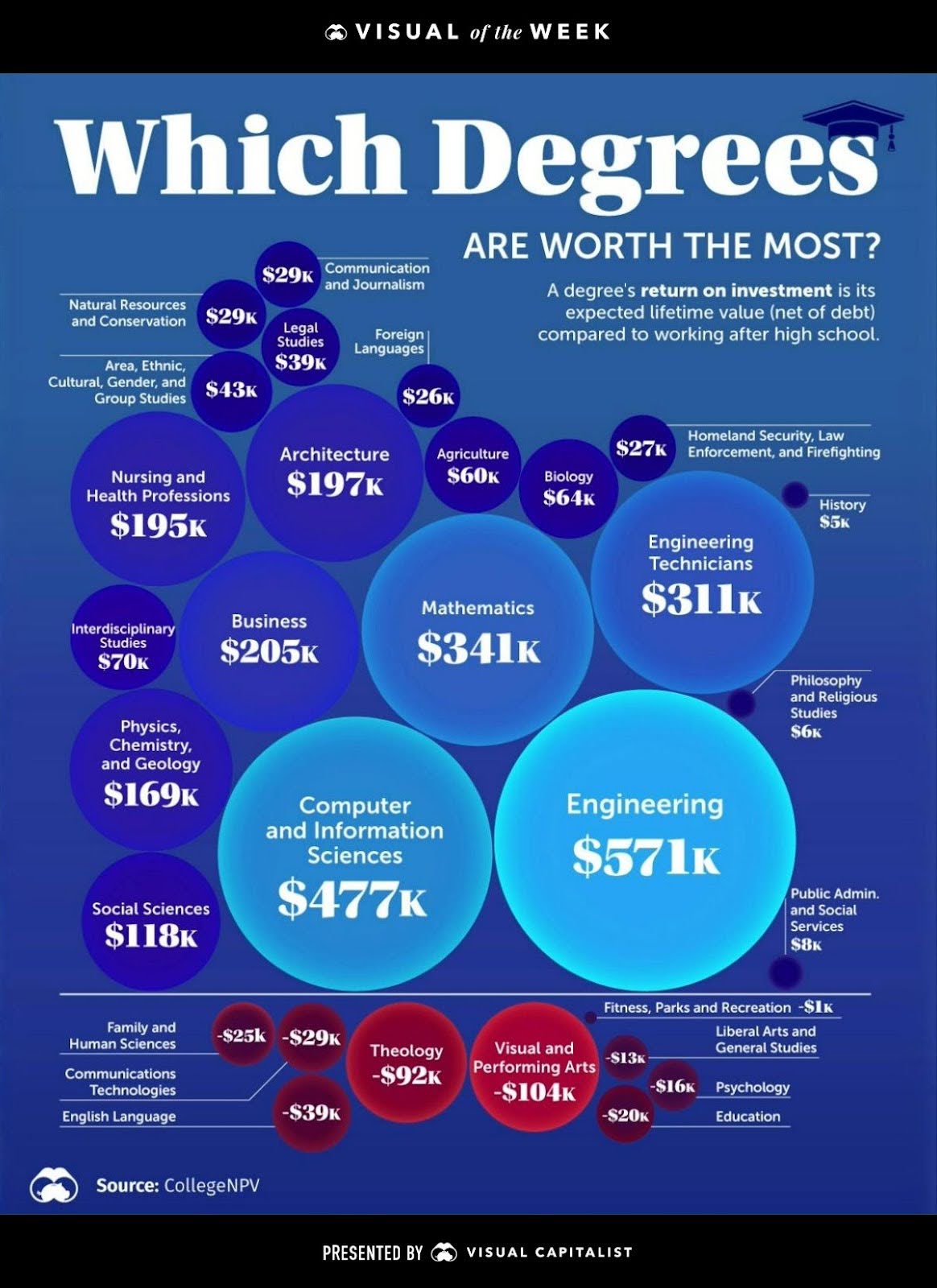
This chart compares the lifetime ROI of different college degrees. Some majors, like Engineering or Computer Science, are financial powerhouses. Others, like Performing Arts or Theology, actually lose money. It’s a brutal but clear visual of value versus effort.
Marketing analysis
This chart nails a principle marketers forget: not all investments give equal returns. Time, money, and creative energy should go where the payoff is greatest. Just like a student picking a degree, a marketer should pick campaigns, channels, or audiences with the best yield.
Why it works
- Shows ROI visually and fast
- Makes an abstract idea (lifetime earnings) concrete
- Uses size and color to guide attention
- Stirs emotion by revealing “winners” and “losers”
Examples
- Google Ads vs. organic SEO ROI reports
- HubSpot’s “Marketing ROI Calculator” tool
- T-Mobile’s ads comparing “real 5G” vs. competitors
- SaaS dashboards showing cost-per-lead by channel
Analyzed by Swipebot
Loading analysis...
