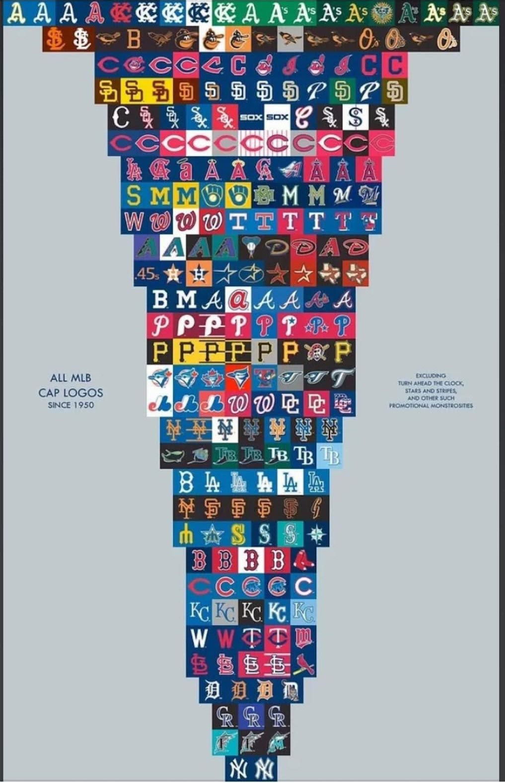
All the MBL baseball cap logos since 1950

This image of every MLB cap logo since 1950 is a masterclass in brand identity. You can literally see how teams have refined, simplified, and modernized their visuals over time—without losing their roots.
Marketing analysis
Each evolution shows how great brands refresh their image while keeping what fans recognize. The best teams didn’t ditch their core letters or colors—they cleaned them up, made them bolder, and easier to recognize on TV, screens, and merch.
Why it works
- Consistency builds trust and recognition
- Small refinements keep a brand feeling modern
- Simplification improves visibility and recall
- Iconic colors and shapes stick in memory
- Nostalgia keeps longtime fans loyal
Examples
- The Yankees never changed their logo—ultimate consistency.
- The Dodgers simplified lines for digital clarity.
- The Astros evolved colors while keeping their star.
- The Brewers revived a vintage glove logo fans loved.
- The Padres found their groove with retro brown and gold.
Analyzed by Swipebot
Loading analysis...
