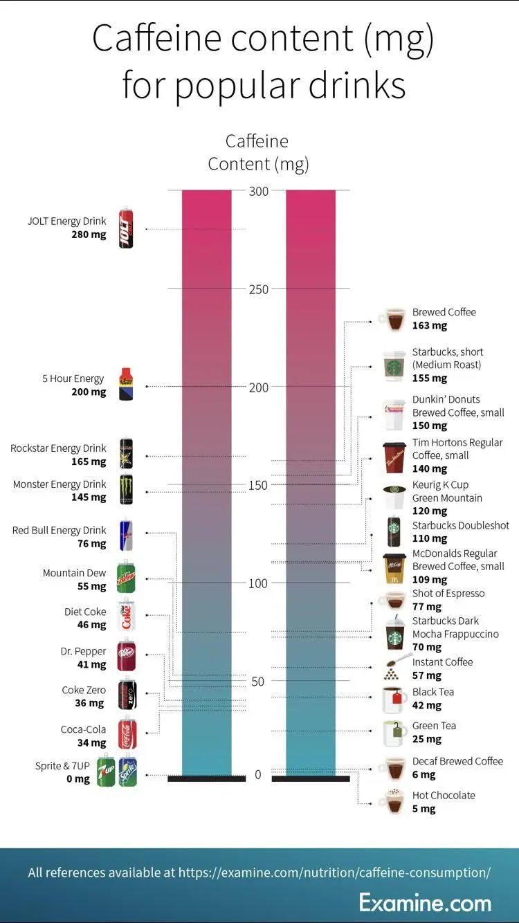
This chart effortlessly displays the caffeine content in popular drinks, making it easy to compare and understand at a glance.


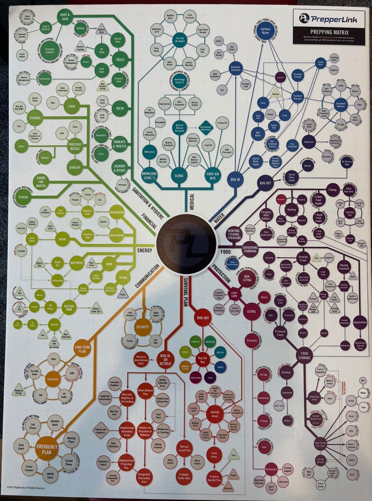
I didn't actually read through all of these different scenarios, but this is a cool graph for a prepper (someone...

A simple chart with unemployment and "underemployment" rates by college major makes this data visually interesting by making the bar...
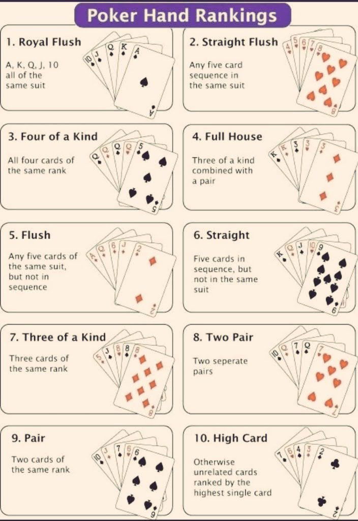
A quick cheat sheet of poker hand rankings — from best to worst. I like simple little charts like this...
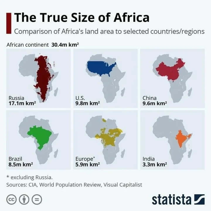
I love when a single graph or chart can update how you think about something. It's quite shocking to know...
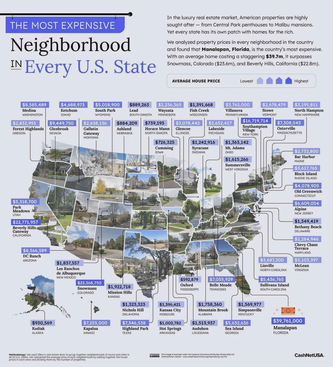
This is an interesting approach to listing out the most expensive neighborhoods in each state: By showing a map but...
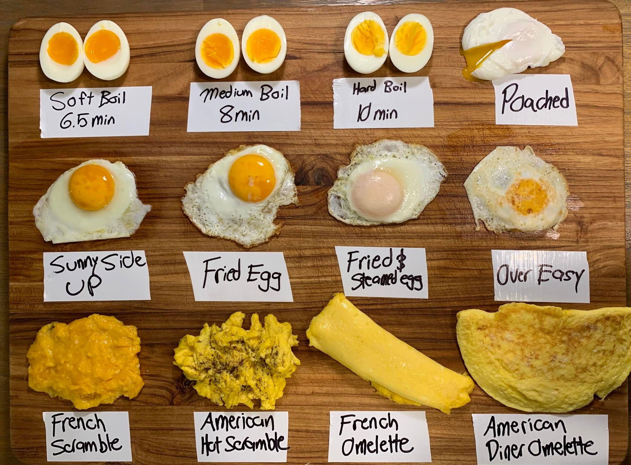
To me, an image like this packs in a lot of data in a very easy-to-understand method.
Search for a command to run...