ConvertKit awesome home page graphic
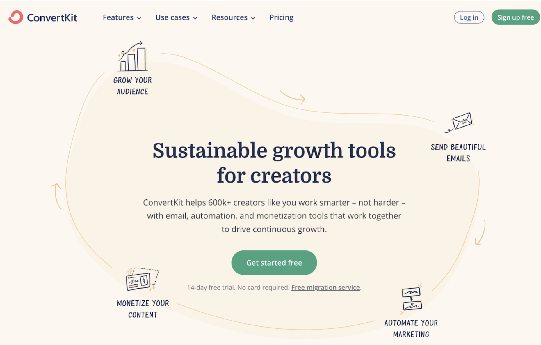
ConvertKit’s homepage nails visual storytelling. Instead of dumping product features, it shows a “Creator Flywheel” that instantly explains how the product fuels nonstop growth for creators.
Marketing Analysis
The circular layout isn’t just design flair. It visually links each step — grow audience, send emails, automate, monetize — into a loop that screams “momentum.” The headline “Sustainable growth tools for creators” sits perfectly in the center, promising continuous motion.
Why It Works
Shows a simple, repeatable success path
Uses motion and flow to imply compounding results
Keeps copy short and centered on creator outcomes
CTA is bold, inviting, and anchored in value
Examples
HubSpot’s “Flywheel Model” replaced the funnel and boosted retention focus
Notion shows “workflows in motion” on its homepage to visualize productivity
Figma loops collaboration benefits visually for user clarity
